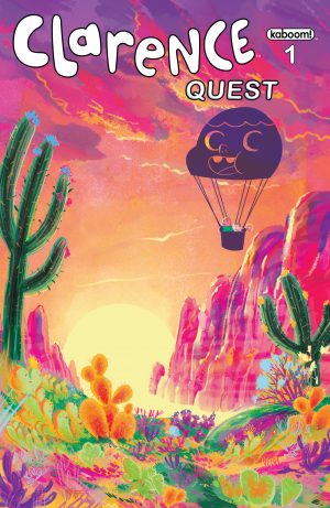
Review: Clarence Quest #1
Not every cartoon is made to be translated into comic form. After successfully adapting properties like Adventure Time and Bravest Warriors (especially the latter) onto the printed page, I had considerable praise to throw BOOM!'s way. Their use of diverse indie cartoon talent from their variant covers to interiors, giving small artists a shot at mainstream publication, is especially admirable. Even when a book failed, you could at least be slightly happy that a cartoonist who probably deserved it was getting a paycheck. Clarence Quest doesn't break any of these trends, but doesn't quite provide a compelling argument for the suitability of the series to be translated into panel form, despite not doing anything largely wrong. The characters are written identically to their television counterparts, there are some nice beats of humor, and the art is unique enough while also capturing the visual feel of the show. But something is missing.
 Being a fan, I noticed immediately how important the art of animation itself is to the style of the show. Unlike Adventure Time, Regular Show, and Steven Universe, Clarence is largely grounded in mundane reality, drawing its charm from its precise observational detail to the minutia of being a gross, dumb, happy kid. Removing those almost reflexive animated details that could only be captured in animation, not to mention the memorably unique work of the voice cast, takes away a good part of why I enjoyed the property in the first place. Perhaps that is more representative of my specific needs as an audience member rather than a technical criticism, but at the very least it considerably affected my experience with this title.
One unusual choice was splitting the artwork between two artists. The comic tells one story from beginning to end, not containing the Boom signature backup story one usually expects, but still has two different artists on hand to illustrate the title. What is odd is the duties aren't split down the middle, but rather one part of the story just hands over to the new artist and then returns back to the original at the conclusion. It isn't too terribly jarring, but it does come off as a strange choice, one that didn't have any real useful impact on the story being told.
Clarence fans don't have any reason to worry about this book. It's respectful to the property, as well-written as you could expect a Clarence comic to be, and professionally, if not memorably, illustrated. However, at the very least for me, the comic failed to capture the ineffable quality that makes Clarence the thoroughly watchable show that it is, something that likely can't be captured exactly on the static comic page.
[su_box title="Score: 2/5" style="glass" box_color="#8955ab" radius="6"]
[/su_box]