
Review: Corsair #1
By Oliver Gerlach
Corsair #1, currently on Kickstarter, is an interesting piece of uniquely British horror work, for all the good and all the bad associated with that subgenre. It follows Agent Corsair, a man tasked with investigating the nastier side of the occult. It’s a sound, entertaining premise, with a lot of potential to explore a range of different aspects of both horror and Britain itself.
However, if that all sounds a bit too familiar, a bit too much like Hellblazer, well… That’s because it is. Agent Corsair is a slightly disreputable occult investigator in a big coat with a character voice that reads a lot like a slightly less colourful John Constantine. There’s no way to avoid that comparison, as it really does stand out from the beginning of this first issue and hangs over it throughout. Any occult detective in British comics has to have a unique hook to escape from Constantine’s long shadow, and Corsair just doesn’t have that; he feels somewhat like a hollow imitator.

That’s not to say that this is a bad debut; it’s good fun and has some hints of a beautifully mysterious creepiness that I haven’t seen much of in comics before. The earlier parts of the story are full of promise which is never quite met; the story rushes along through its 23 pages without really having enough time to build up the atmosphere teased so early on. The writing is all fairly good, apart from several moments where a lack of punctuation leads to some very unnatural dialogue. Again, there’s a lot of raw promise to all of the writing, but the execution doesn’t quite live up to it.
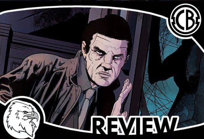
The side of the comic that does live up to its potential, however, is the art. It’s stark, black-and-white (although the Kickstarter page promises colour), and ugly. The faces are fleshy and grotesque and human in all of the right ways, and the staging is frequently unsettling. Many of the best current horror comic artists have similarly unattractive and human characters, and it works wonders for keeping things both believable and slightly uncomfortable in a medium dominated by implausibly perfect figures. The storytelling is clear throughout, and honestly, the only issue I have with it is the choice of rigid crosshatching for shading, which I recognise is entirely a matter of personal taste. Beyond that, there is a single full splash page in the issue, and it makes one hell of an impact. It’s a beautiful page and one completely unexpected in a project that’s otherwise so artistically straightforward. It’s the kind of work I’d gladly buy prints of, and that’s unusual. I’d love to see some of this work coloured, but the monochrome state it’s in here is no disadvantage. The Kickstarter page for the series shows some of it in colour, and the choices made there are a very good fit; hopefully, that’s what the series will look like going forward.
Overall, then, Corsair #1 is a book that fails to do anything particularly interesting and feels like a rushed substitute for Hellblazer. It’s an enjoyable read, but it really would have liked more space to tell its story and build up a unique atmosphere. I have no doubt that Magicianshouse (the pseudonymous artist) is more than capable of creating a beautifully evocative atmosphere for this if given a chance; she just needs to be given that opportunity, and a single 23-page story is not really the best way to do that. There’s clearly a lot of talent here, and a lot of potential, but this first issue fails to reach that, which is a great shame. I wanted to like this more than I ended up doing.
Available on Kickstarter
SCORE: 3/5
Corsair #1
Writers: Nick Gonzo
Artists: Magicianshouse
Colours: Alexa Renée
Publisher: Madius Comics