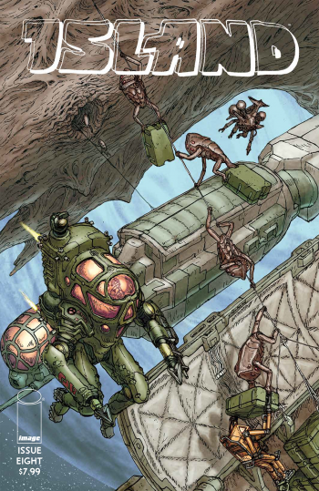
Review: Island #8
Island #8 marks another solid entry to the anthology dedicated to bringing you exciting original work from people you might not be familiar with. The newest Island starts off with some intro art pages from Spanish illustrator Xulia Vicente. Other than the consistently high quality of stories (not to mention the fact that it's stuff you just don't see anywhere else on the shelves), the intro art is the other obviously best thing about Island. Vicente gives us six pages of pixie-like creatures living atop a petrified dragon. The pages are full of life and all kinds of little touches. One of my favorite things is that she draws a marketplace with some food stands and the reader gets to view a few of the stands from behind. I love that we get to see behind the stands because by showing things going on behind them it adds more depth what's going on in that area and it doesn't feel like a boring, cardboard cutout of a scene. The fact that I have a chance to enjoy an odd touch like that (from an artist I might not have ever had a chance to hear about, no less!) is the exact kind of thing that I pick up Island for.
The first full story in the issue is "Mostly Saturn" from the prolific Michael DeForge. I can't imagine that most of Island's readership hasn't already come into contact with DeForge's work, but I'm hopeful that appearing in something being pushed out by Image might gain him some new fans. "Mostly Saturn" represents DeForge at his absolute best: the guy has an imagination that cannot be beat by anybody else in comics. He piles odd things together and creates entire mythologies in such deceptively simple arrangements of lines and colors.
 "Mostly Saturn" is DeForge showing off that he can take a cornball elevator pitch and completely sell it in a short, complete story, while somehow running completely counter to your expectations. In this story, people who die on earth are reincarnated on Saturn at their age of death, and then age backwards. He approaches this topic as he does in many of his other comics as if it is a documentary, but this story ends with a twist. DeForge's aesthetic is the thing that grabs most people, but this story drives home my belief that his strongest feature is his storytelling. Not only is he imaginative in his visuals and his concepts, but he takes those concepts places you don't expect, making twists and turns that give the stories a great deal of depth.
The issue ends with the final chapter of Simon Roy's "Habitat." The first chapter of this story was my first exposure to Roy's work and completely blew me away. Additionally, juxtaposing DeForge's style and Roy's style in a single issue is both jarring and awesome. Especially compared to "Mostly Saturn" where DeForge is being very stripped down and design conscious, Roy's much freer hand marks a huge tonal shift, from his handwriting to his panels packed with machines and guts.
Of course my favorite part of "Habitat" is... well, the habitat. When Roy draws a spread it never disappoints; but, because of his visceral drawing style, fight scenes can feel like a real mess. Even when this makes for some hard-to-follow reading, that's not totally a bad thing. When people are murdering each other and destroying machinery and stuff is exploding and people are bleeding, things aren't cut, dry, and neat: they're chaotic. Roy captures that chaos, just a little too well sometimes. Despite how overwhelming some of these sequences are, there is usually a panel or two worth pausing on to appreciate how much detail Roy puts into a single panel, even when the story is moving quickly.
[su_box title="Score: 4/5" style="glass" box_color="#8955ab" radius="6"]
[/su_box]
