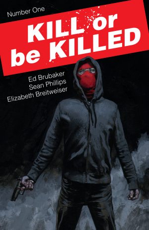
Review: Kill or be Killed #1
Ed Brubaker and Sean Phillips make a hell of a team and while that’s obvious, you gotta kind of wonder if they’re dying to work with other creators by now. I don’t know how many years into their one of a kind Image deal they’re into, but shit… I’m glad they locked that down.
Kill or be Killed has never been more relevant. Reading it this past week I was in shock with just how close the narration was to listing what was going on in the real world. That also made me a bit sad considering that comics are produced months and months in the past which means not much has changed in the world from the time that Brubaker wrote this to this point now.
The book begins on action and Brubaker uses one of the most used storytelling devices in comics, but he uses it the way you should. It’s the classic, here’s where the story is going to go. The reason it’s successful though is that the issue doesn’t end up there. It’s a look at the story to come and to set the stage for our main character’s transformation. The narration at this point is again, a pointe description of our real world. That story doesn’t life you up there as we meet our main character Dylan and his narration leads us to what he calls “the start of everything.” But it’s not. Brubaker  hijacks us a few times as he digs into Dylan’s past to get to the true start of Dylan’s new lifestyle.
It’s a little all over the place, but the result is that it feels like a real person trying to think of their entire life and put it in an order that makes sense to explain to someone. And because of this we get to know Dylan and even if he doesn’t realize it, but by taking a journey with his back story in such a way we see that there’s never a clearly marked spot in our timeline that says, “here," but rather a culmination of events that lead us down a chosen path.
The story gets more depressing as we learn that Dylan is suicidal, but I assure you, that’s when the story really picks up. There was one panel that made me fall in love with this story and it’s because the art and writing transported me into Dylan’s shoes: “…Snow is so fucking beautiful…” When you get to that panel you’ll hopefully see what I mean, but I kid you not it was like a movie in which the screen zooms and suddenly I was right there with Dylan and I too thought the snow as fucking beautiful. Then, just when you think you’ve got this story figured out… Brubaker swerves you and it’s great. That I won’t tell you anything about, but he takes this grounded story about a guy ready to give up on life and flips everything on its head. And again, it’s great.
Of course none of this really works without Brubaker’s strongest collaborator Sean Phillips. What’s left to say about this guy’s artwork? It’s hard to say that this is the best work of his career because I truly believe that he’s been delivering the best work of his career. Too give a strange example, he’s like Milo Manara, in which you recognize his style and it’s extremely good and consistent. You never look at it and go, “his work on blah was better.” Instead you should look at his work as a whole being one of those amazing creators that never dipped and were just consistently amazing.
There’s not a clear credit indication, but I believe that Elizabeth Breitweiser is the colorist for the issue. She’s just listed alongside the creators in the book and credited with “Art by” on Image’s site. The coloring is that muted earthy tones that works perfectly with Phillips style. It gives the world personality, but I wouldn’t say that it looks like everything else from the team. It’s in the same family of visuals for sure, but Breitweiser’s coloring here does make it look different from something like Fatale or The Fade Out.
The other day I was having a hard time figuring out what books from Image I was even reading anymore. The answer was actually kind of startling because I couldn’t come up with one consistent series that I follow. Thankfully with titles like Snotgirl and Kill or be Killed coming out, I will once again be diving into the Image pool. I just hope that more titles of this quality are on the way.
[su_box title="Score: 5/5" style="glass" box_color="#8955ab" radius="6"]
[/su_box]