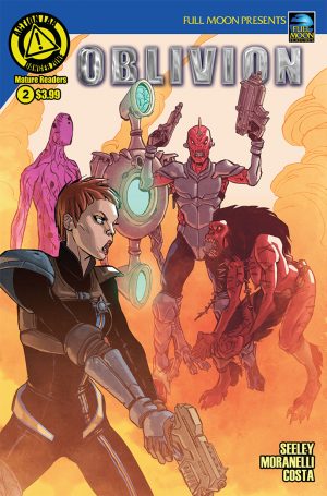
Review: Oblivion #2
The review for Oblivion #1 was my first review for this site. I deliberately picked out something that I thought I'd enjoy for the sake of starting on a positive note and it let me down hard. It was strangely paced, a bad introduction to newcomers and a boring slog for anyone familiar enough with the source material to not need every character reintroduced for this one. I picked up Oblivion #2 because I actually didn't think it was beyond salvation. Comic books are short and judged by their chapters. In doing so, I think Oblivion #1's faults came in trying very hard to make its first issue worth the asking price and to hype up its audience. Pacing a comic book by 20-30 pages a reading session is extremely difficult. So I'm back to see what Oblivion does with this extra leg room it has.
 As I was hoping, yes, this issue is better. It's not bogged down in re-introduction, the strange matter of pacing regarding the writing's insistence on not allowing its art to do its job conveying information has vanished as if the writer and artist had some time to be friends, maybe grab a cup of coffee between issues, work out their, well, issues and form a burgeoning relationship. The storytelling is better, information is doled out evenly between quiet, dialogue-driven sections, and the art is perfectly serviceable in the job it should have been given from the start.
This is the issue in which having enjoyed the movie it's based on isn't so much a requirement as a strong suggestion. Characters speak as though we already know them, alleviated somewhat by the occasional inquiry or conversation topic brought up by our female lead, a scaly green lizard-lady. However, the two villains so far are intriguing in setting up two different methods for allowing for character development. The first is a gross red alien with an extremely phallic protrusion coming out of his head who gets a great deal of back-story and dialogue to flesh out his personality. The second, a black-haired dominatrix who's character is so ingrained into her dialogue and actions that it's impossible not to get a read on her character. In contrast, the heroes appear bland and uninteresting.
Despite the obvious improvements, I'm loathe to give this issue any higher than a three out of five in that it doesn't seem to be leading to anything of any consequence. The drama falls flatter than a lead pancake as we finally begin to understand the villain's plot, which involves a magical altar that makes people magically tune out after hearing the word magical altar. The heroes don't even have a read on the concept that the bad guys could be up to something of any meaning to anyone as they are transfixed on the curse that has befallen our female lead. This is the structure of a mid-day sitcom in which two stories, an A story and a B story provide appropriate pacing to maximize laughs while minimizing the effects of prolonged exposure to any one situation, except that there are no laughs.
If the characters were simply a little more fun to be around, it would get a recommendation out of me. If I felt as though the characters had something to accomplish other than, so far, nothing, then I would give it a recommendation. I don't have a reason to be compelled to pick up the next issue. If there's something that Oblivion gives you that I'm not getting, then by all means pick it up, it's a vast improvement on issue #1. But until I figure out why someone would want to continue besides pure nerd-appeal, which I totally get but don't believe to be a selling point, then I'm going to have to give it a solid, resounding "lukewarm."
As resounding as "lukewarm" can be, anyway.
[su_box title="Score: 3/5" style="glass" box_color="#8955ab" radius="6"]
Oblivion #2 Writer: Tim Seeley Artists: Romina Moranelli Colorist: Marcelo Costa Publisher: Danger Zone Price: $2.99 Format: Ongoing; Print/Digital
[/su_box]
