Review: Superman #1
The best parts of Superman #1 are drowned out by new status quo that will be overwhelming to everybody except deeply entrenched fans. Here's a brief overview of what's going on for those who are out of the loop concerning DC's long-arching editorial disaster over the last five years: the New 52 rebooted the whole DC universe, bringing into existence all new forms of all of your favorite heroes, more or less. The Superman of the New 52 world is not the Superman of 2010; you know, the Superman who died, but then wasn't really dead? Yeah, that guy was just... gone.
Except not really.
 It turns out that he was actually alive, living secretly under a different name along with Lois Lane, raising their half-alien son, Gohan-- er, sorry, Jon. What they're doing with Superman is a good analog for what they're doing as a company: they're aborting the whole goddamn New 52 continuity in order to bring back a line of characters from a time when DC wasn't getting shellacked in market share by Marvel. Bringing back pre-New 52 Superman is a ploy at winning back the obvious section of the readership they have completely bled out during their failed New 52 experiment.
I'll save the broader rant about the problems at DC and focus in on why this is a problem for this first issue of Superman: if the goal is to win more readers (let alone make a good comic), the worst possible thing you can do is anchor your plot around insular continuity oddities that only a reader of 5+ years would be able to follow. And here's the thing: Google won't even really help you figure out some of this stuff if you're a young new reader, or a seasoned comic vet looking to finally check out Superman during a new reboot phase. If you go on a DC comics wiki, all I can say to you is good luck: you'll have to go down an epic rabbit hole, cross-referencing New Superman, Superman Prime, Earth-One, Earth-Two, Oreo Superman, Polka-Dot Superman-- you get the point.
I'm not exaggerating about how fantastically awkward and confusing the beginning of this book is going to be for any new reader. It opens with Superman standing over Clark Kent's grave. Sure, you can hit up one of your comic friends and ask, "hey, uh, what's the dealio here? And he's got a kid now?" And sure, they'll answer, "well you see, the New Superman is dead, but the old one was secretly never gone and has a kid, and there's another guy who's Clark Kent [yeah I didn't even mention this shit] but he's not either of the other guys."
Who is this book for?!! It's aiming to do the exact opposite thing that the New 52 was. Maybe that's how Rebirth is being billed and I'm missing it, but this seems way more insular than anything a large comic book company should ever be shooting for. It's essentially admitting defeat and saying, "well, we tried to make good comic books and keep our intellectual properties fresh, but we did a bad job, so here, just take the old stuff, we won't shoot for new readers anymore." I appreciate that it's interesting to see old Clark interact with the impact that new Clark had on the New 52 world; but, all that means is that the New 52's editorial funeral is interesting. It gives me no hope or context for what they're going to do now, not to mention the kind of message this sends to any reader who might have actually enjoyed New Supes.
What makes this especially frustrating in Superman #1 is that the bit about Superman finally having a proper son is good. Being from the generation raised on Dragonball Z, I have a very visceral and direct appreciation of how much of a fire you can light under a sort-of boring character by giving him a son who is learning how to have powers. The prospect of a half-Kryptonian dealing with the fact that his father is Superman, dealing with the fact that he can never have any real attachment to an entire half of his genes, dealing with having to keep his laser vision under control--its great stuff. But at least in terms of this first issue it's almost completely buried under the weight of continuity garbage.
 All of that said, it's easy to see that my biggest beef with this comic is how inseparable its contents are from a messy editorial context; however, there are still a lot of things to like about what's happening. A brief one page sequence in which Clark saves some of his barn animals as his son looks on, proud of his father, is executed perfectly. Clark is made to look like an epic giant, shrouded in flames, dwarfing his own home in the background as his son looks on. It sets the tone of the comic very quickly: his son looks up to his father because of what a tremendous man he is, without ever having seen him do much heroing. It's his integrity and his kindness in simple moments like this that make him so incredible, and executing that in a single page, especially in the midst of all the stuff that's leaving a bad taste in my mouth, is very welcome.
Other pages aren't as successful for me. A sequence in which the family cat is snatched up by a hawk shows a lack of imagination. It's a feature I noticed in a few of the other newer DC books that seems to just be a feature of DC's superhero books. There's this tendency to put an interesting, tense sequence of actions in a pile of panels over one portion of the page. The overall narrative feel is fine because it serves to rapidly increase tension leading into a page turn; yet, it robs the sequence of some if its character. What starts as an awesome sequence showing the hawk across sun-filled sky at the top of the page and Jon and his cat on the bottom goes on to cram the action into a stack of panels. After establishing the spatial relationship between the sky and the ground in such an interesting visual way, though, you'd think they'd use the opportunity to play with that relationship through the rest of the page, rather than just using the height of the page to work through the action.
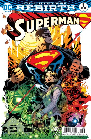
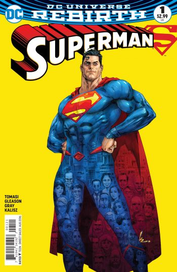
Most of the conversational sequences feel verbose and cramped, with the minimally talky closing sequence setting up the future of this comic. The inks feel blocky and heavy-handed at times, but for the most part it fits the tone the book is shooting for. And the cover... well, the cover is clunky, as seems to be the case with the rest of the Rebirth books so far. The real Clark might be back (actually, isn't even this Superman not the original one?), but I'm not sure the tight, iconic visual identity that we associate with the Man of Steel returned with him. Hey, at least they brought back the original numbering of Action Comics: good to know DC is focusing on the important things.
[su_box title="Score: 2/5" style="glass" box_color="#8955ab" radius="6"]
[/su_box]
