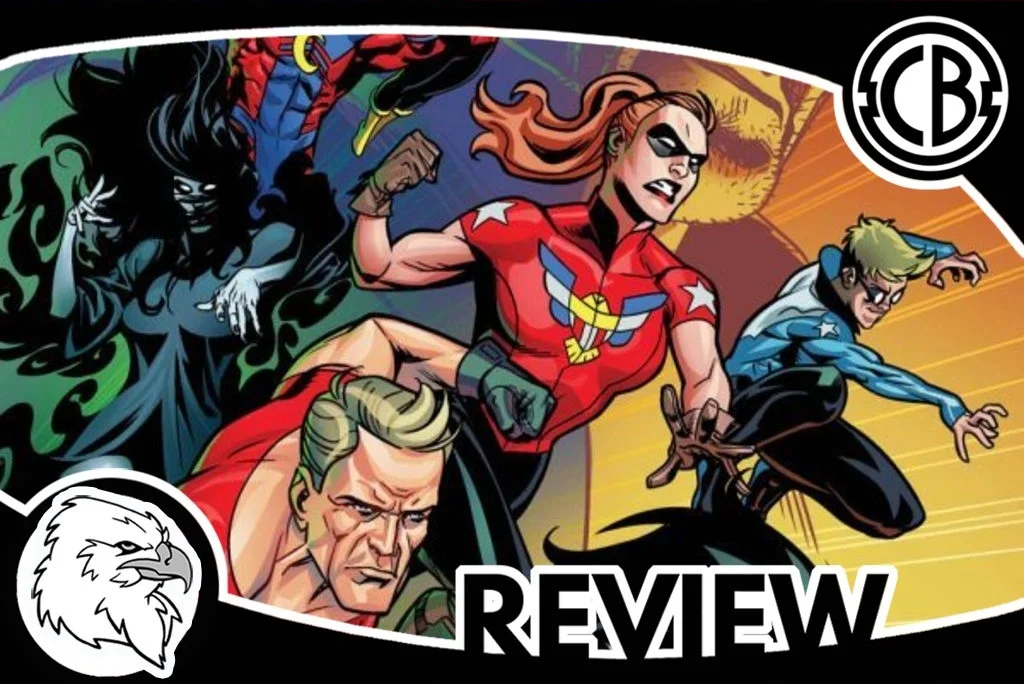
Review: The Mighty Crusaders #1
By Patrick Wolf
When I first flipped through the opening pages of The Mighty Crusaders, my initial thought was: “Boy, am I gonna tear this issue a new one.” But, the more I flipped through the pages, the more it grew on me. While The Mighty Crusaders still has a lot of kinks that need to be straightened out, the writing is strong enough to almost make up for the story’s aesthetic failures. If you’re an Archie Comics fan and are looking to dabble in the world of superheroes, this series is a great gateway comic. For comic aficionados, however, I’d approach with caution.
The Mighty Crusaders takes place in the backdrop of the near-annihilation of their former crew. Now, under the new leadership of ‘The Shield’, the hodgepodge of superheroes must find a way to work together if they’re ever going to defeat an enemy as dangerous as the one that nearly wiped-out their predecessors. But little do they know, a mysterious scientist has just released an ancient evil—and it won’t wait for the team to be ready.
Right off the bat, I want to confess I was prejudiced against this series before I even opened the book. I know that sounds terrible—especially for a critic who prides himself on being objective, but upon glancing at the cover, the art looked so uninspired and generic I was convinced I was dealing with a dud. Then, when I actually flipped through the pages, my suspicions were confirmed: the action sequences were trite, the characters were derivative, and the dialogue was cheesy. To make matters worse, most of the character designs were shameless rip-offs of some of the most iconic superheroes in North America, and the ones that weren’t rip-offs were so generic they may have well have been.
I won’t go into too much detail, but three characters that particularly bothered me were the ‘Web’, the ‘Comet’, and the ‘Shield’. The Web was a knockoff of Spiderman, the Comet of Cyclops, and the Shield of Captain American (although, ironically, the ‘Shield’ has no shield). In fact, the only original character from the bunch was Darkling. Darkling has a fascinating design and an even more interesting set of abilities. Apparently she can manipulate shadows, which seems like a new power as far as my knowledge goes. That said, with the exception of Darkling, most of the comic felt like a cheesy 80’s rip-off.
At this point, I was ready to write the series off when something happened that almost never happens: the story got better. Once I got past the opening action sequence, I found myself being more and more drawn into the narrative’s inner machinations. I liked the Shield’s dynamic relationship with the older Shield, and I found the medley of traumatized team members to be fascinating. But, perhaps, what pulled me in the most was the issue’s backstory. There was something particularly sinister in how the former Mighty Crusaders were dispatched—especially in a series whose artwork is so bright and innocuous. For some reason, this really got to me, so I’m going to give the writing team points for it.
All in all, because the writing in this issue intrigued me enough to look past the story’s aesthetic failures, I’m going to give this series a recommend. I just want to make it clear that the artwork and character designs are so derivative and unimaginative that they’ll severely irritate any seasoned comic book reader. So, reader be warned: if you’re looking for cutting-edge art, this isn’t the series for you; if you’re looking for what could turn out to be an interesting story, however, you might want to take a chance on this one.
SCORE: 3/5
The Mighty Crusaders #1
Writer: Ian Flynn
Artist: Kelsey Shannon
Colorist: Matt Herms
Letterer: Jack Morelli
Editor-in-Chief: Victor Gorelick
Editors: Alex Segura & Vincent Lovallo
Associate Editors: Stephen Oswald & Jamie Lee Rotante
Publisher: Dark Circle Comics


