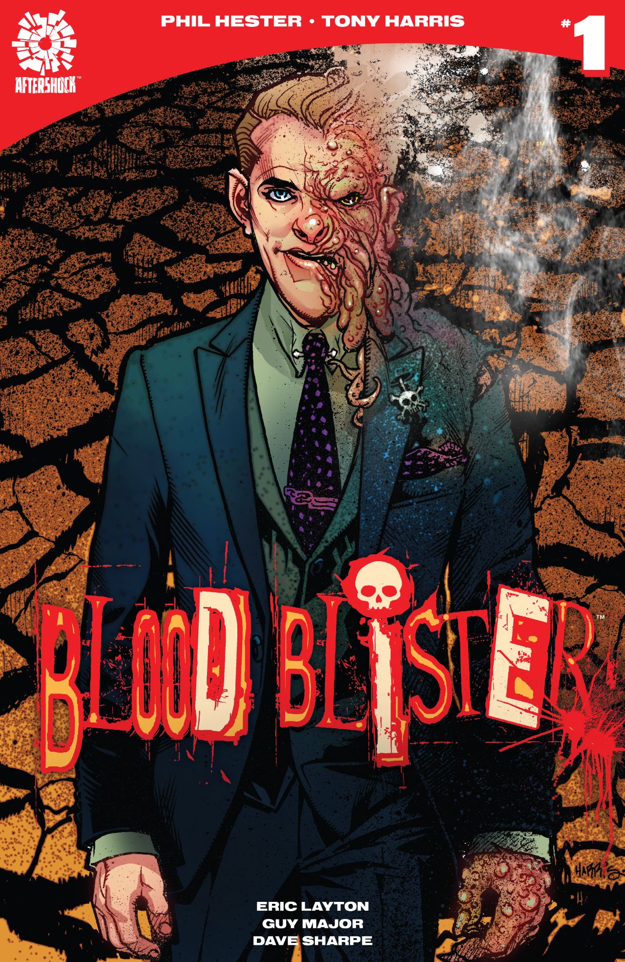
Review: Blood Blister #1
By Dustin Cabeal
Blood Blister is going to need a few more issues. I was left on the fence the entire time while reading it. There were parts that I liked and other parts not so much. It was a teeter-totter read in that way, but at the end of it, I really couldn’t tell if I liked it more than I disliked it.
Part of this comes from my confusion about what it’s really about. We’re shown a lot of things, but it doesn’t come out right and say “Hey, this is what’s going on, interested?” If it did that, I might be more inclined to be interested. Instead, we meet a lawyer that’s getting people to sign up for a class action lawsuit. We later find out that he’s doing this for another reason and that’s to protect the interests of another business that’s paying him a lot of money to keep them from being sued for more.
All the while the guy continues to run into people that are talking strangely with religious overtones. We know this because their words are in red, while everyone else’s is in black. At one point, the dude pinches his arm in a rotating door. The art struggled at this point because it wasn’t perfectly clear how this all went down or why it did. Sure, he was being chased by a homeless man shouting the gospel, but the entire door scene was just weird. He gets a blood blister, hence the title, and decides to squeeze it out in his office. It’s weird. While there’s more to the story, it’s kind of the only important part of the issue to read.
Again, I went back and forth on this issue. I wasn’t interested in the lawyer part, and it was pretty clear that it wasn’t going to be the focus of the story. The religious aspect teetered from interesting to annoying and by the end found some neutral ground in-between. The writing was solid, but the story had several moments of being overwritten. Especially the dialogue, in the beginning, it felt cluttered for the sake of being full and natural, but none of it was particularly interesting to read.
The art played a big role in my neutral impression of the book. I never particularly liked it and was bothered by the first panel. It was strange to meet the main character in a giant centered circle overlaying on another panel. That and the smoking guy looked Sam Elliot in Thank You For Smoking, at least until I got to the bottom of the page. The style was one that I never got into while reading. It was rounded and almost bubbly, yet it had thick linework. The characters ended up looking over the top and ugly. There wasn’t a single character that wasn’t hard to look at which may have been intentional, but still bothered me. Other than the door scene though it told the story well enough, it tried a bit too hard with the panel designs, and some of it is just lost in the thickness of the linework.
I’m not ready to rule this one out. Usually, when a story leaves me feeling as conflicted like this, I wonder if it worth reading more of, but in the case of Blood Blister, I’m going to need a few issues to decide. If you saw something I missed, let me know. Hell, if you were on the fence, off it on either side, let me know that as well.
Score: 3/5
Blood Blister #1
Writer: Phil Hester
Artist: Tony Harris
Publisher: AfterShock Comics


