Review: Decelerate Blue
By Dustin Cabeal
Often when I’m reviewing a comic, it’s an intricate dance of scales. Whatever side ends up with the most weight on it effects the review the most and ultimately decides the score. Decelerate Blue sat in the middle for most of my reading. For everything cool or interesting it did, it managed to do an equal amount of disinterest.
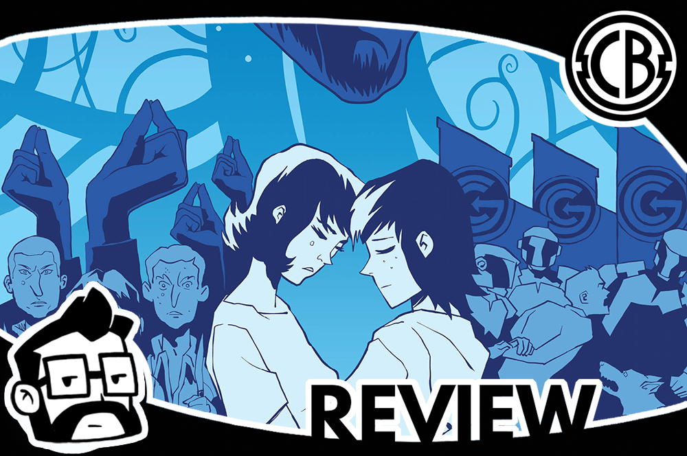
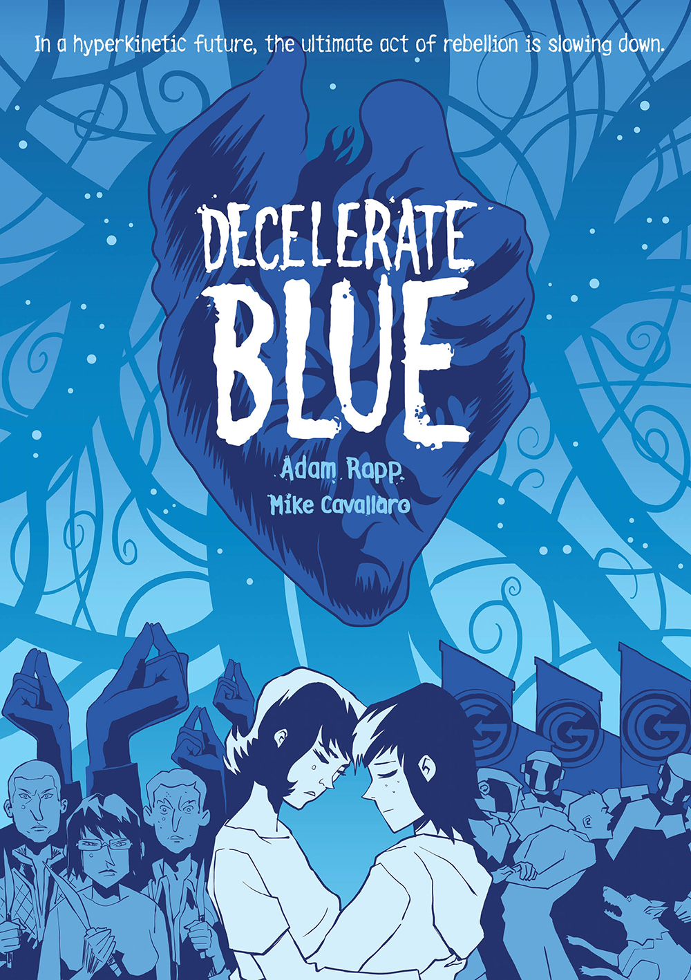
The first came from the cover which is almost entirely blue. The paper was also blue which made me excited to open the book up and see… white pages. It seems that just the very tips of the paper were actually blue which seemed like a weird thing to do and an even bigger opportunity that ended up being missed. And so went the rest of my reading.
That’s a cool concept… and that is not a cool concept… oh, I like that… oh, I don’t like that.
The story is part Fahrenheit 451, a sprinkle of Philip K. Dick and Shakespeare. Yes, Shakespeare, which probably has already given away a lot of the story. I know that the very mention of Shakespeare in the story made me pause and hope for a better ending than I was sure to get.
That prayer went unanswered.
It’s the future, and everything is moving quickly. We eat fast food; we sleep standing, we use shells to fuck (not really in there) and when we finish our sentence, we say “GO” to indicate to everyone else that we’re done talking. It’s “hyper” which is a term the story uses in place of cool. In fact, any term that’s related or implies speed is a “good” word to use.
Our main character Angela is fifteen and hitting that phase in which the world sucks, and she’s figured that out. She’s also been given a book, a physical copy, that predicted the speeding up of society and it’s greatly changed her outlook on life. Eventually, Angela heads to a tree to find something her grandfather buried for her, but while looking for the object, she’s grabbed and pulled underground. There she meets the underground resistance, people that want to move slow and enjoy the pauses life offers.
There’s nothing that is surprising about the story. Every time it would seemingly offer a twist in the story, it would veer right back to where it was going. There was something disingenuous about the message of the book. It never got the chance to show why you should slow down and enjoy life nor did it show how great disconnecting from technology could be. Instead, it just kept adding details and factoids to the world. We do this because big brother wants us to do this and that’s not what we want. The government, or whatever it’s called in the story, is big brother cranked to twenty, and yet they couldn’t find the underground movement… under the ground.
The love story was underdeveloped for a lot of the same reasons. The important and interesting aspects of the story are not given enough time to develop or be interesting. Our two lovebirds fall in love at first site, and then they share two more cute moments, and that’s about it. I never once got into their relationship or felt their love for one another and yet at the end it seemed like a huge part of the story and yet it wasn’t.
The supporting cast is a complete waste. The formula for the supporting cast was, introduce them, keep them around until logic determined that they would be separated from Angela and then see them at the end of the story. There’s a reason that there’s a large supporting cast and that reason is so that you care about them as the story continues. Unfortunately, I got to the end of the story and didn’t find myself caring about any of them. Just another underdeveloped aspect of the story.
The artwork is the one glimmer of beauty for this story. It looked and felt like a Bruce Timm animation at times. Artist Mike Cavallaro effectively uses the black and white medium to navigate the story. Decelerate Blue’s artwork isn’t black and white and waiting to be colored, but someone that understands the contrasted needed to for a B&W tale. The only disappointing part was that the white wasn’t replaced by blue. There’s a practical reason that I won’t get into for spoiler reasons, but I will say that it wasn’t worth it. It would have been a much stronger visual story if the pages were blue as well.
I didn’t hate Decelerate Blue, but it was very disappointing. The premise offered a lot of potential, but the end product feels rushed and underdeveloped. The art saves it a bit, but there’s only so much the art can do in the end. I don’t know if I would recommend it as a purchase unless you’re curious about the inspiration cocktail I outlined in the beginning. If you’re not, then maybe hit the library for this one.
Score: 3/5
Decelerate Blue
Writer: Adam Rapp
Artist: Mike Cavallaro
Publisher: First Second Book


