
Review: John Wick #2
By Sam King
John Wick #2 was supposed to come out in October of last year. Here we are seven months later. John Wick as so many know, is a retired hitman who can kill dozens of people by himself in fast and creative ways, with a number of weapons. He also turns mundane objects into murder weapons, like pencils. I loved both films and I was excited to hear about a comic series, and I can honestly say that I was even excited to get the chance to review it! The last reviewer who reviewed issue #1 wasn’t very impressed and quite honestly, I can see why.
Don’t get me wrong. This isn’t the worst comic I have ever read and the art isn’t the worst I have ever seen (although some panels come close). The main problem here is that, as fans of something that was incredibly epic, we want that same quality in our reading of related stories. This says John Wick in big letters and it has John Wick on the cover, so we naturally want JOHN WICK and think we are going to get him, but we really don’t. Now I know what the counter argument could be. “Sam, this is John Wick BEFORE the movies.” I know that. “Sam, you have to let time pass for a character to grow. Not every character can just be an automatic badass.” I KNOW. Does any of that make me want extreme badassery any less? Hell no. I don’t care if this is before the movie, John Wick is a fleshed-out character already and should be treated as one even in his years that came long before where he is at in the movies. Granted, it may be early for him to be able to kill people with pencils so rapidly, since he is only now learning about the Continental. Fine. That’s not entirely what I wanted though. I didn’t just want him laying waste to a bunch of people (although that is kind of present to a certain degree and he is creating traps to snare the people he wants to get rid of). I wanted a masterpiece of a comic, because the movie was a cinematic masterpiece. The shots were creative, the lighting added to the scenes and the world built with and around the story was incredible.

None of that translates into these pages. The colors and panels feel flat. The action isn’t as smooth as it could be. The colors are what get me though. Nothing feels all that creative about this story. Comics aren’t film, but there are some amazing comics out there with artwork that will make your eyes pop out and leave you drooling. Some are put together and drawn so well that they even feel like cinematic experiences as you read them. That isn’t this one. The setting is one I am incredibly familiar with, considering I have lived in El Paso, Texas for well over ten years. I was psyched when I read the setting header, because I was like “hell yeah! Wick in El Paso? What could be better?!” Then I read a few pages and my short-lived dreams were completely shattered. I can honestly say that nothing in the comic feels like El Paso. It looks like a generic place that could be anywhere. I guess that they only put it in El Paso so it could be close to the border of Mexico, even though Baja California, Mexico is nowhere near El Paso. At some point John Wick is in an empty area with a wood fence and grass and a cat, between some buildings. There’s no spot like that in El Paso. If there’s a break between buildings, odds are there is nothing but concrete, although you may find a cat. Wooden fences like that? Good luck, most people in areas like that image would have chain link fences. There’s certainly no random patches of grass. Go in yards and parks, that’s where grass is. It’s a DESERT in West Texas, this isn’t Dallas (I’ve been there a lot too for the record, so I’m intimately familiar with these locations I’m mentioning). El Paso has more flavor to it. It is a desert, with lots of Hispanic culture, and none of that is present, even though it should be and would do a lot more for the story. Next time just set it in a non-existent place, because you won’t disappoint people as badly.
Also, the little gang Wick is after aren’t even the most creatively named. They’re referred to as the “Bills”. One is Pecos, one is Buffalo, and one is simply Billy. Like no Texan is going to pick up on Pecos Bill and Buffalo Bill Cody? Then just Billy? Why couldn’t you keep your gag going and at least call him Kid, as in “Billy the”? It is a cheap gag that is not carried full through. I could excuse it if the story or art was better, but it isn’t. The art carries none of the punch or flow that the films do and it is just one disappointment after another.
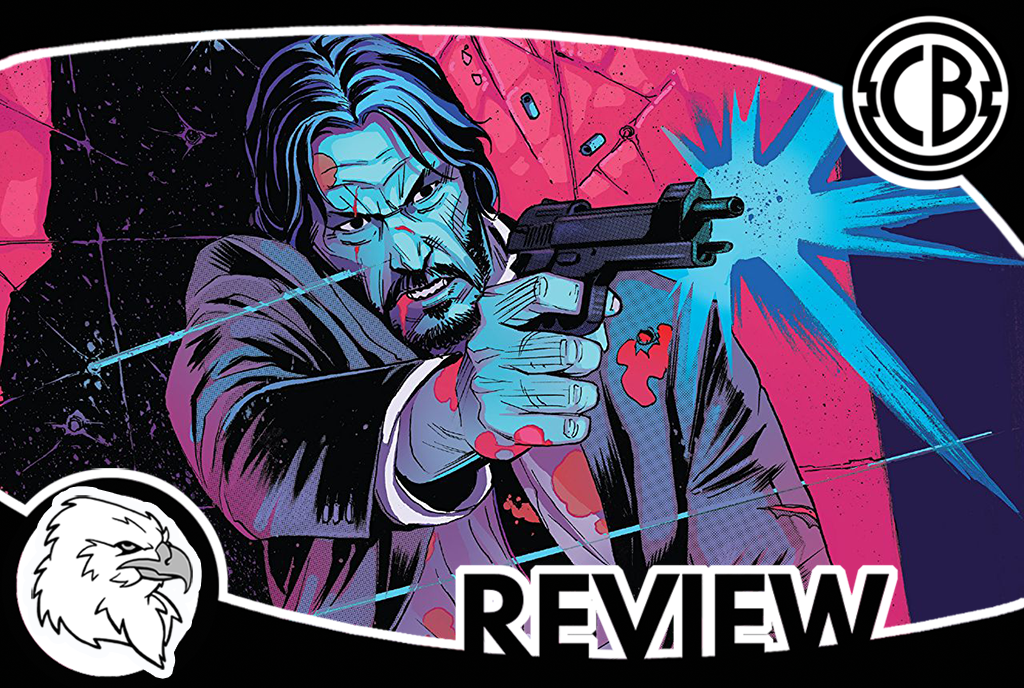
I know I’m whining a lot, but it is because I expected more. This isn’t just a generic title people weren’t going to notice; this is a franchise that carries some weight and popularity. This comic is written in a way that says “it doesn’t matter what is inside or if the essence of the films are captured, people are going to buy me anyway cause I’m part of a popular brand”, and that makes me sad. This title had a lot of potential. We waited seven months for this, the least you could’ve done in that time is spruce up the art and make the wait worth our while. The cover art style is what should be in the inside. The colors are intriguing and suspenseful, but don’t make their way into the story itself and that is a serious shame. I would actually bet that incorporating more color risks like that on the cover would up the art quality inside significantly. Take risks, be creative, stop giving us rotten dog crap in a paper bag and lighting it on fire while taking peoples’ money for it. Overall the art just looks cheap and choppy. The story isn’t bad! It is mediocre at best so far, but it isn’t as bad as the art and that is what pisses me off.
I won’t say this is a total loss, because it is an okay time killer story wise and I think (or rather, HOPE) that this title will get somewhere better in the future. Maybe the next issue will totally blow our socks off and make us go “there he is! This was worth the wait!” but I wouldn’t put money on it. Check this one out if you simply have to for peace of mind. If you don’t, just wait for the trade or maybe even see if your local library is willing to get it when it eventually comes out and see if it improves over the course of its run. This isn’t one I’d keep on a pull list and anxiously anticipate. It needs serious improvement. If I could say anything to the creators I would say: Learn your locations, bring them to life, and go back and watch the source material again because you’re severely missing the point of why everyone loved the movies so much. Hell, just get a better artist altogether, one who wants to actually maintain facial consistency and overall quality. I’m not convinced that the cover artist and story artist are the same. They may have the same name, but one is definitely an evil twin. That or the guy was body snatched mid-sketch and the colorist was abducted by aliens while coloring so they got someone else cheap and had him finish the job in a lackluster manner.
Score: 2/5
John Wick #2
Dynamite Entertainment