Review: Quince #1-2
By Dustin Cabeal
I have meant to check out Quince… Well, since the first two issues released. They’re not well past that, but I wanted to get a review down before the series ended and I missed out completely. The concept is that a young girl has her quinceañera and then obtains superpowers for a year.
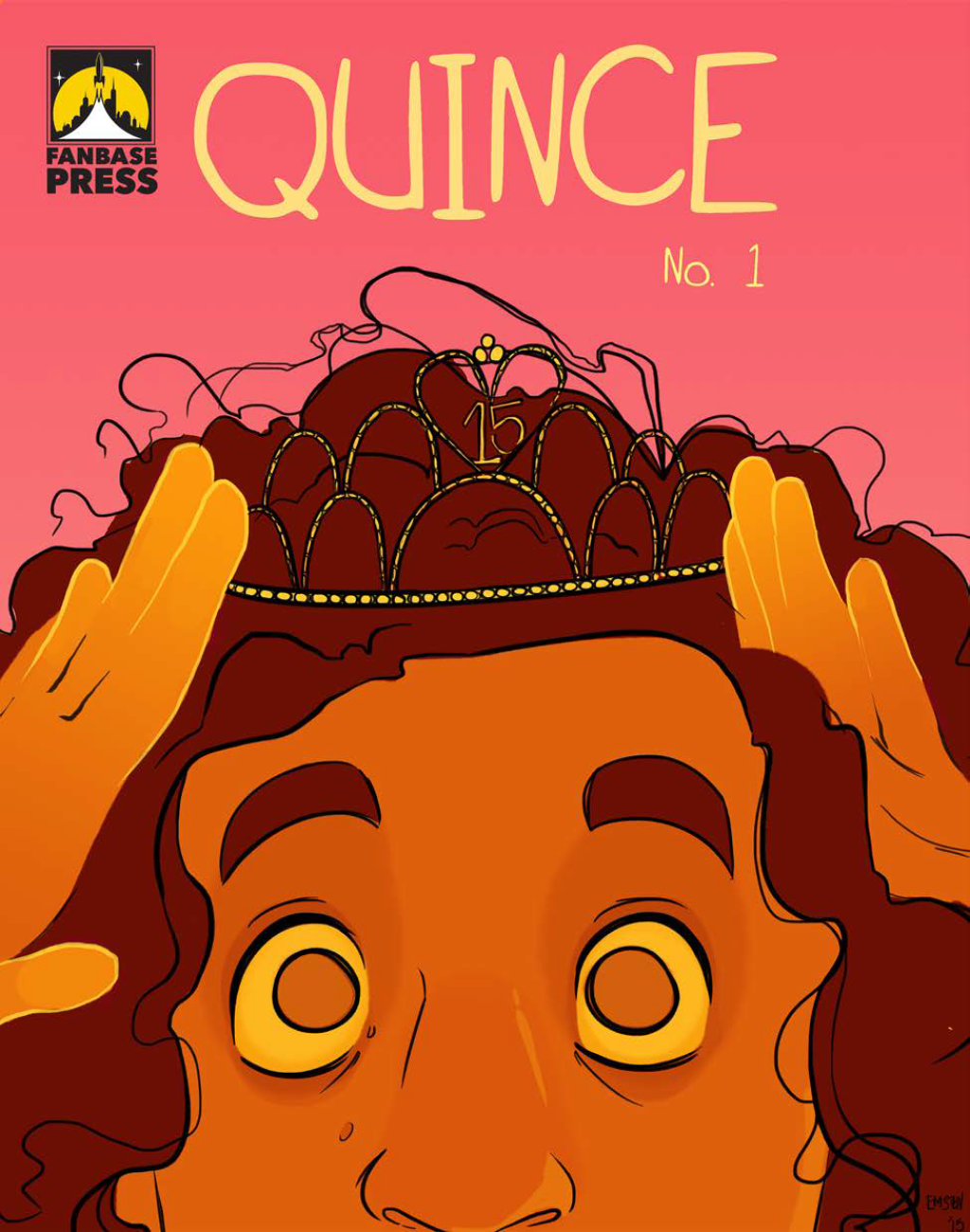
That’s a cheat though since the first two issues barely skim the idea of that concept, but instead focus heavily on introducing and building up the main character Lupita. The first issue shows her average day and the world that she lives in leading up to the excitement of her party. The story moves on to the party rather quickly in which Lupita or Lupe freaks out and destroys a bathroom. End issue.
That was instantly what I loved about Quince; it was short and sweet, but extremely effective in just ten pages. If only more stories would follow this format when attempting to be shorter. Discovering that the issue was so short was exciting since I have a hundred titles to read at any given moment and if I hadn’t paused for a review, I would have likely read the entire run of the series in one night.
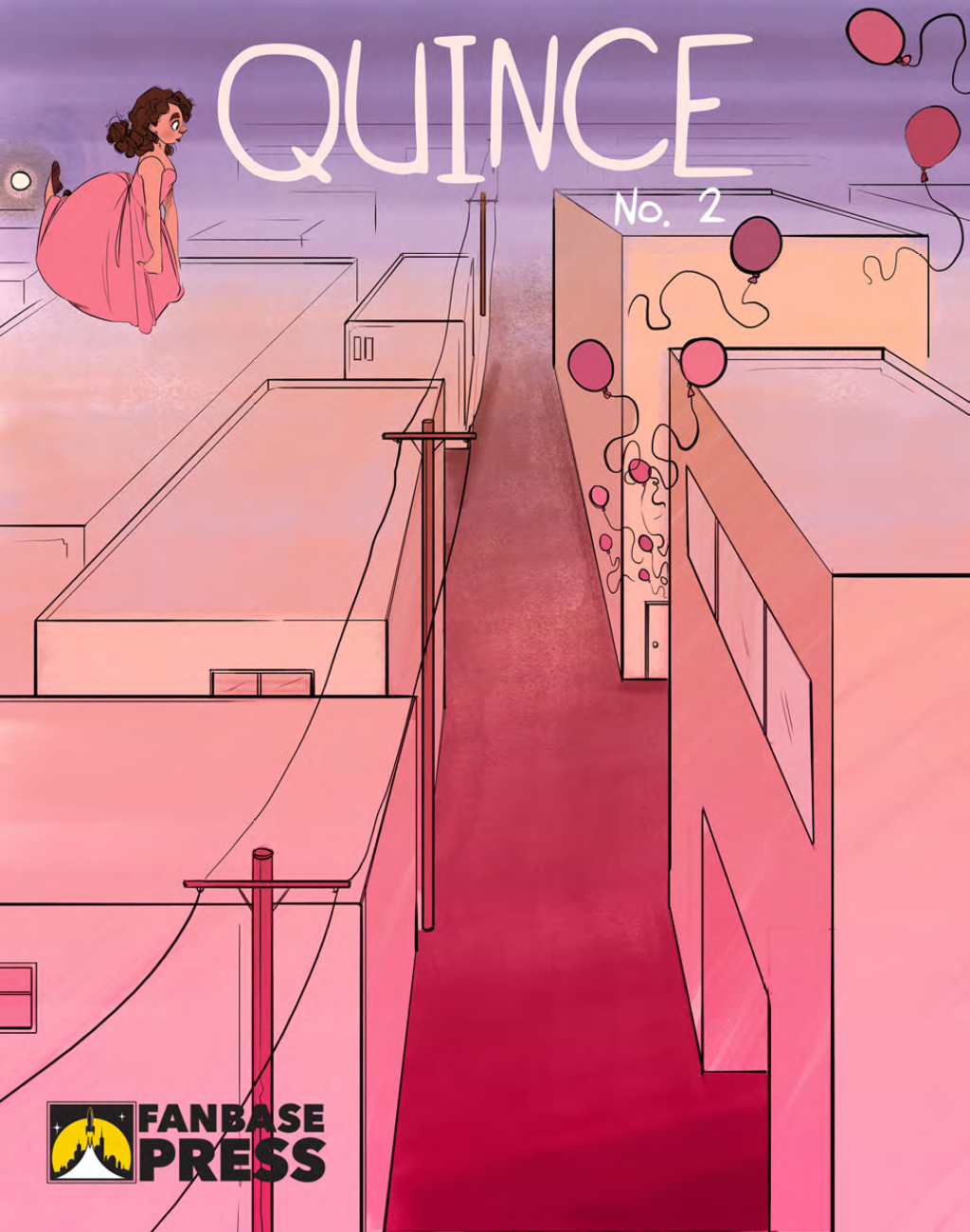
The second issue is another charming as Lupita, and her Abuela share a moment in the bathroom that she’s just wrecked. She teaches her how to use her powers, but it’s over as quickly as it began, and Lupita falls back into the party like it was all some crazy dream. Until she floats at the end of the issue. Now that’s how you do a cliffhanger!
The writing is incredibly strong in this series. Lupita narrates throughout the entire story, and while it has a diary entry vibe to it, it’s not annoying. There’s never a, “Guess what happened to me today diary” moment, but rather a woman reflecting on her past trying to wrap her head around all these crazy memories. The dialogue is also very natural and believable. The characters come across very real because of this, and that includes bit characters that don’t have much page time.
Before I cover the art, I’m going to talk about the lettering since it plays into the effectiveness of the story. I love the lettering. The font is amazing. It’s bubbly and looks like a woman’s handwriting. It fits the setting of the book which is following a fifteen-year-old girl. The narration is different from the dialogue, but the font for the dialogue is also fitting and different than what a lot of comics use. Frankly, it was nice not to see the same twenty fonts that I’m used to seeing in comics.
As for the art, it’s wonderful as well. The characters all look realistic with their designs, their clothing, and their body shape. No, it’s not ultra realistic, but it was extremely detailed with clean line work throughout. The coloring doesn’t have as much depth as the artwork, but it works to give the story a style and consistency. It would be nice it if had more lighting effects, which would give the background and objects greater details.
There are a lot of superhero comics, and frankly, I don’t much care for the ones produced by large corporations anymore, nor do I want to read indie superhero stories. Plain and simple, I’m burnt out on the genre as a whole. There are occasions in which I find myself enjoying them. Times when the storytelling and artwork are so strong that I can’t help but be swept into their world. Quince is one of those times, and I am craving more issues of this story. Also, it deserves praise for being released in English and Spanish which is something I’ve personally thought more comics and comic companies should be doing. Also, I’m not so delusional to think I’m the only one to have had this thought, hence the bilingual editions of this comic.
Score: 5/5
Quince #1-2
Creator: Sebastian Kadlecik
Writer: Kit Steinkellner
Illustrator: Emma Steinkellner
Publisher: Fanbase Press


