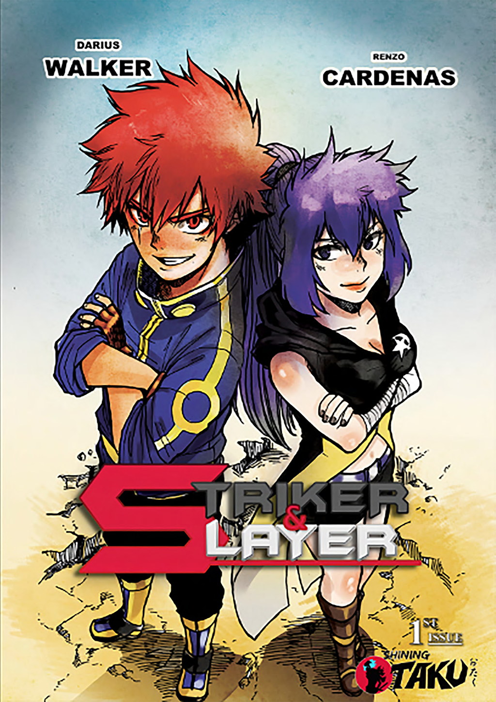
Review: Striker & Slayer #1
By Dustin Cabeal
Anytime I pick up a comic, and the first page is a wall of text, I kind of just sigh to myself. The wall of text as I call it is a big cheat because it’s conveying information that the creator can’t or doesn’t want to work into the story. It’s common in sci-fi because creators think it’ll speed things up by explaining the world instead of showing it.
Striker & Slayer heads this route so that we can just jump into the story and not go through the origins. I don’t hate that, but in this case, it might have been better to just cover the origins with a flashback or two. Instead, we still have no idea of what type of characters they are outside of what was force feed to us in the opening.
The story begins in a town being taken over by a cyclops devil dude, when bam, out pops Striker. Instantly you’re given a lot of info about him, but it’s all just aliases that he’s known by which left me wondering if any of it was relevant to the story. We meet his partner Slayer, and they go to town on the bad guys because that’s what they do. They’re heroes for hire. Back at their office, they get a visitor for their next case, and it’s relatively predictable where the story is going from there.
The plot isn’t very original. Even the cliffhanger to the issue wasn’t a surprise, but more like, “Oh that makes sense.” It’s not breaking new ground; it’s just new characters doing similar things you’ve read or watched before. There just isn’t that hook there yet. Another issue is the narration and dialogue. It’s overwritten which is just strange considering how much work the art is doing. The facial expressions are great and convey a lot of the story, but instead of trusting the art there’s an abundance of dialogue. Much like the tidbit about the extra names, it leaves you wondering how much if any of it is useful to the overall story.
To my surprise, the artwork was outstanding. Not perfect, but for a comic going for the manga style, it comes pretty damn close. What I like about it is that there’s still an American flair to it. It works in that way and doesn’t need to be so manga inspired. It is in all black and white. The inking could use some work as there are times that details all bleed together. Otherwise, the artwork is fun and should be trusted more when it matters, not just when people are walking.
Striker & Slayer is missing that hook that would bring me back for another issue. It’s easy to read, it’s good looking, but without enjoyable characters or a new twist on a familiar concept, it lacks anything to make you want to return to it. It understands all the manga-ish elements it’s going for, but perhaps the influences are bleeding in too much, and the story is being lost in the process.
Score: 2/5
Striker & Slayer #1
Self-Published


