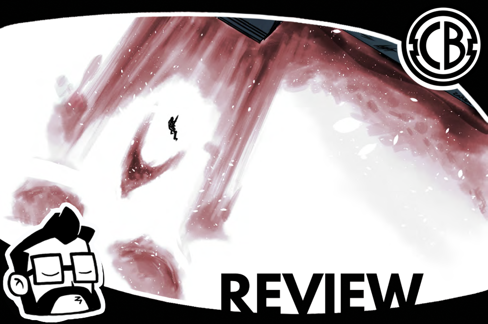
Review: The House #1
By Dustin Cabeal
The House has an uphill battle to fight because it has such a familiar concept. Just looking at the cover and the title made me think of Hell House by Richard Matherson which lead me to think of half a dozen titles that have homage Hell House in comic form.
That is, unfortunately, the meat and potatoes of this story; there’s a house that has existed throughout time and grown with the ages, likely due to the amount of souls it’s claimed. Oh, and it’s like the Tardis, bigger on the inside. The story follows a platoon of American soldiers in World War II that end up finding the house and taking shelter for the night. The have one POW who is German and freaks the fuck out upon seeing the house. He’ll likely be used as a scapegoat in the future because of course, these men are going to die one by one. The story alludes to one of the soldiers being a bit of a psychopath as well, so all the tropes and story devices are covered.
The writing lets the art do the talking, for the most part, that is to say, that it’s not flooded with dialogue and there’s no exposition or explanation of what platoon is going through in the house. It makes a decent effort at introducing the characters, but since most of them are fodder, it’s hard to back anyone character, especially when it’s not clear who the main character will be. You know, the one that will blow the house up or something. There is some narration, but it’s very inconsistent and only shows up in chunks here and there.
The art starts off looking great. We see a quick lapse showing the house throughout time, but then we settle into the WWII setting, and it begins to stumble. The action was choppy, not that it was hard to follow, but it looks like a series of jump cuts rather than a flow of sequences. The character designs leave a lot to be desired. If someone didn’t have facial hair or an accessory, it was hard to tell who was who.
The coloring and the lettering are actually the sharpest things about this first issue. The coloring saves the art in a lot of places. A less talented colorist would have downgraded the artwork, but as it stands, it makes it look good and sometimes even great. The lettering is very professional looking and makes the book stand out from the usual bunch of indie comics I read.
With this only being an eight-issue mini-series I would give it another shot. I don’t know if I would just keep throwing chances at it, but it didn’t put me off enough to skip it. So far there’s only been one true scene of horror so it would need to step up that element to keep me. The biggest obstacle though is that it feels too familiar and is playing it too safe. If The House wants to hook readers, it needs to be just like the House itself, strange and inviting but filled with horrors and right now it’s not.
Score: 3/5
The House #1
Writer: Phillip Sevy
Artist: Drew Zucker
Colorist: Jen Hickman
Letterer: Frank Cvetkovic
Self-Published


