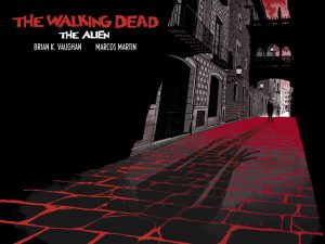
Review: The Walking Dead: The Alien
It’s hard not to get behind this project. It was launched on Panel Syndicate meaning its “Pay What You Want” and creator and comic mogul Robert Kirkman gave the creative team of Brian K. Vaughan and Marcos Martin his blessing to use his world and franchise and keep all the monies. It’s respectable and it shows that creators will always take care of creators. The problem is that I didn’t like the story. It was the safest story you could tell in The Walking Dead universe and because of that it offers very little to the universe. Sure there’s the twist at the end and while it wasn’t obvious it instead made me nod with some silent reasoning along the lines of “of course he is… of course he is.” Did it shock me? No... not at all, if anything it was just too on the nose.
The story is set in France, but we find An American in Paris type situation so that we know what the fuck everyone is saying. He teams up with a woman dressed like a Knight… like an actual Knight and of course their meet-cute is her being his literal Knight in shining armor. She needs him because he has a working flashlight… the thinnest of reasons to team up with someone in the apocalypse, but it’s a one-shot that can’t touch the rest of the universe with the exception of the ending and so it'll have to do.
 The ending… oh the ending. Like I said, of course he is. It was the least impactful part of the story which is saying a lot since the story has no impact. There’s never a real sense of danger because we’ve become to desensitized to this world and it's a one-shot. Zombies aren’t scary anymore because any one-handed asshole can survive them and bring ruin to makeshift society one after the other…. After the other. To put it plainly this world isn’t scary because of the threat, it isn’t scary period.
The art is good, but not great. Martin attempts to keep the world similar to the main The Walking Dead series and so he keeps everything in black and white. While Martin’s artwork is detailed it’s by no means a good fit for this style as it leaves a lot of white on the page. Whereas series regular Charlie Aldard uses the entire page and makes use of the contrast between the black and the white, Martin’s pages mostly look like they’re waiting for color.
Instead of playing to the standard of the comic franchise it would have been nice for the creative team to play to their own strengths. Vaughan has some dialogue, but it was missing his trademark narration that he loves or even his off-topic banter. Martin delivers on the art in skill, but misses completely when it comes to the basics of black and white only art. Both men deliver work that would be considered good if they were anyone other than themselves which ultimately leaves this feeling like a one-shot that just wants to deliver that twist ending and nothing more. Back it if you want, but really unless you’re either a blind loyalist to either The Walking Dead or Panel Syndicate, you can skip this one. Regardless of the price.
[su_box title="Score: 3/5" style="glass" box_color="#8955ab" radius="6"]
The Walking Dead: The Alien Writer: Brian K. Vaughan Artist: Marcos Martin Publisher: Panel Syndicate/Skybound Price: Pay What You Want Format: One-Shot; Digital
[/su_box]
