Review: Strange Kids Club #5

I have been sitting on this issue since… I don’t even know when. My wife had a kid and I became Mr. Mom and while that doesn’t make it into all my reviews for this one it does because I was kind of new to the Mr. Mom’ing and while I wanted to sit down and read the hell out of Strange Kids Club I never did. Obviously I have now and all I can say is that I want more. I may even want the first four issue to check out and that’s fucking rarity from me.

Strange Kids Club is one half fake magazine and other half real comics. There is a mixture of real ads for nerdy shit throughout the magazine, but then there’s stuff like retro video games that don’t exist. You kinda want them to exist, but they don’t. In a way, it’s a reminder of what made magazines so much fun as a kid. Strange Kids Club is trying to capture that feeling. Because there are generations today that don’t care or want to understand magazines and comics in print form. Because as a kid it wasn’t there only source of info and they don’t have to wait a month for new news on a subject because the internet has made all of that instant. Strange Kids Club or SKC is a throwback to that. It’s a polished, well produced, fantastically written magazine for a generation that’s aged, but still hasn’t grown up.

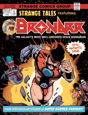
SKC-Magazine-5-coverNow… as for the comics. There’s a few winners. I enjoyed the art for every single one of them. I want to say that first because that’s really important. The artwork is killer here and if I had money I would totally hire any of these artists for a project. On the story side… there were a few too many in the fantasy barbarian genre. That may have been an intentional theme. Thankfully they all told different stories and had different gags, but by the time you get to the last one it’s like okay that might be too many. Also they’re a bit too short. I wanted just one or two more pages of each one to really get the feel for them. As it stands I would definitely return for more, but it was a shame that I couldn’t make up my mind on them with what there was to read.

Again the production on this magazine is great. It’s 100% legit in terms of that. There’s reviews of board games, vintage movies and again ads for products that are real and yet strange. I loved it. Even flipping through it again for this review it put a smile on my face. If you want to check it out head over to StrangeKidsClub.com and keep an eye on Kickstarter for future issues to support. Hopefully Founder and Publisher Rondal Scott III is already working on another issue.


Score: 4/5


Strange Kids Club #5 Publisher: Rondal Scott III Publisher: Strange Kids Club Price: $5.00 Format: Print

[su_button url="http://strangekidsclub.bigcartel.com/product/sk-magazine-issue-5" target="blank" style="soft" background="#0d0b0a" size="7" center="yes" icon="icon: external-link"]WEBSITE[/su_button]

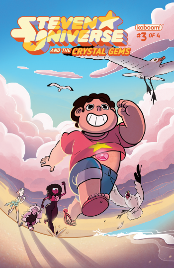
Review: Steven Universe and the Crystal Gems #3

A seemingly malicious crystal specter from Gem mythology is loose on Beach City with no conventional way to stop it and it's up to Steven and his guardians to solve the mystery of this assailant to save the citizens of his coastal home.

Sounds like a pretty standard episode of 'Steven Universe', no? It reads like one too, the tone, pacing, and characterization being very much in line with the successful Cartoon Network program. This third part of a four-part miniseries feels like it could easily be animated into an actual episode to air on television, which interestingly enough is part of the reason I found this comic mildly underwhelming.

Steven-Universe---Crystal-Gems-#3-1The problem is the comic reads like storyboards, which isn't a bad thing inherently, but it is a problem when they are paced so evenly to actual animation time that a twenty-page issue of a four issue miniseries covers the same amount of ground that perhaps three minutes of the television show could have when put in motion. Beginning to end, not a lot happens in this issue and a lot of what is shown feels like it could be compressed in a way that the comic medium is capable of in ways the animation medium is not. It all feels like something that could have been consolidated into a tidy giant-sized annual rather than four financially distinct installments. With licensed comics of existing all-ages properties, creators have the opportunity to tell stories that couldn't be told in the property's home format. With 'Crystal Gems', you get exactly the TV show in comic form, but without the ability to pull something new out of the series lore and not a lot of personal flair.

The art, like the writing, is functional but unmemorable. Intentionally rough and unfinished looking with dirty linework and sketchy colors, its on-model enough to give you the feel of the show but doesn't really do anything interesting with its lack of polish, not lending any individual character to the book.

While I appreciate a lot of Boom's all-ages lines for being some of the better licensed comics from the major publishers, 'Steven Universe and the Crystal Gems' highlights a lot of the reasons I tend to stay away from the miniseries companions to their ongoing titles; asking readers to fork over more money each month for content that often doesn't provide more bang for the buck or stories that benefit or require what should be a highlight format. The miniseries format should be where the property can take some risks aesthetically or narratively, but having worked in a comic shop, I've seen titles like the 'Adventure Time' minis consolidated into one shapeless stack of unsold issues, treated like comic shelf clutter. This comic isn't bad, but with so many titles fighting for shelf space out there, I can't say I blame comic shop owners when these books get lost in the shuffle.


Score: 2/5


Steven Universe and the Crystal Gems #3 Writer: Josceline Fenton Artist: Chrystin Garland Publisher: BOOM!/KaBoom Price: $3.99 Release Date: 5/25/16 Format: Mini-Series; Print/Digital

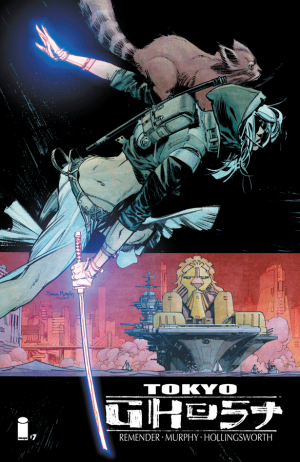
Review: Tokyo Ghost #7

Heavy handed social commentary aside, Tokyo Ghost is still a damn good comic. It’s crazy to think that in only seven short issues Remender and Murphy have achieved so much, and with the start of a new arc, a whole new story unfolds. The tragic love story between Led Dent and Debbie Decay continues, only, this time, it’s even more depressing. This time around there is no hope of escape or redemption, only revenge, and shit gets brutal. When I first started reading Tokyo Ghost I saw the connection between Remender’s dystopia and Warren Ellis’ Transmetropolitan. Both comics use a dystopian future to mock the present, depicting an entertainment crazed populace that has very few brain cells left. Transmetropolitan decidedly takes the high road and touches a little on politics and philosophy, while Tokyo Ghost takes us on a much more bloody path. The first arc showed us the undying love that Debbie had for Dent, her media addicted boyfriend. Through that devotion the two of them were able to escape the techno-crazed L.A. and reach the peaceful tech-free Tokyo. Japan’s tech free stance had allowed them to maintain a peaceful existence outside of the influence from the rest of the world. I have to say in the Tokyo issues, Murphy’s art was beyond gorgeous, perfectly contrasting the harsh, rotten world of L.A. with the tranquil beauty of Tokyo. The peace couldn’t last and in a desperate act Dent relapsed to his tech drugs, went ballistic, and killed every single person living in Japan by detonating a bomb.

TokyoGhost_07-1This aftermath is where Remender leaves us, with Dent resuming his place as a bodyguard for Mr. Flak (the corporate king of L.A.) with Davey Trauma as Flak’s advisor. Tokyo is now a giant theme park for the rich, and Flak and the .01% of society are going to live there and let L.A. die. This is when Debbie (who is somehow still alive) rejoins the picture. She has the katana that was gifted to her by the leader of Tokyo that acts as an EMP, shutting down all electronics around it. And.. here it is, the name drop of the title, she has become the… Tokyo Ghost! Ok, so yeah, it’s kind of a lame way to bring the name in, especially in the second arc, but whatever. At this point, the social commentary has become secondary to the plot and it’s mainly based on action and violence (not that it wasn’t before). The puns and jabs at tech culture today fade into the background, they’re beginning to feel stale, but the heart is still there. At the end of the day, this is still a sad love story about a woman trying to break someone she loves away from addiction.

After the end of the last arc I kind of thought that Debbie would inevitably end up killing Dent, and now it seems that that’s the only option. How many times can he relapse, kill thousands of people, and just have her forgive him? It really seems there is only one recourse, and that is death. Tokyo Ghost #5 was soul-crushing, watching the beautiful, peaceful Tokyo get ripped to shreds was both infuriating and tragic. And worst of all, we got to watch one of our protagonists do all of the killing, someone who we had spent issues watching heal and change for the better.

Now with the last peaceful, beautiful place (thank you Sean Murphy) on Earth destroyed and turned into another wasteland of corporate greed what is left? Debbie returning with the EMP Katana to kill every one of those bastards. All of a sudden this is Kill Bill in the future, and bloodshed is the only answer. Honestly, I’m okay with that. At this point I kind of hate every character except Debbie for what they did, but also what they didn’t do. Part of what makes this comic so sad is the apathy and complacency that these people have. They don’t care what happens because they are numb to it, especially Led Dent, and that’s what makes it so hard to watch. Debbie was the only one who ever cared enough to try to change her world and now there’s nothing left but death and destruction for all.

[su_box title="Score: 3/5" style="glass" box_color="#8955ab" radius="6"]

Tokyo Ghost #7
Writer: Rick Remender
Artist: Sean Murphy
Publisher: Image Comics
Price: Print: $3.99
Release Date: 5/25/16
Format: Ongoing; Print/Digital

[/su_box]

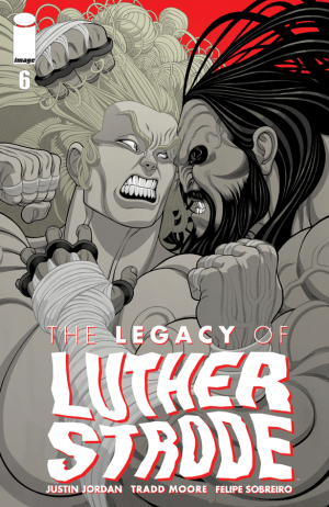
Review: The Legacy of Luther Strode #6

That’s a wrap folks. Anytime there’s an ending some people are going to be satisfied and others aren’t. I find myself in that latter which is just a real bummer. You can say it’s because I’m a reviewer and I’ve overanalyzed this entire series given the fact that I’ve reviewed all three volumes, but that’s not why. Because history shows that as critical as I am of this series… I love it. I’ve loved it from the beginning. I’ve bought it from the beginning and supported it not only with reviews, but with sales. This has been one of my favorite series from the beginning and so the reason I’m disappointed with it is not because of my critical eye.

So why am I disappointed with it?

LegacyofLutherStrode_06-1Well it honestly doesn’t matter because this series has reached a certain level in the comic book community that it’s revered. It can do no long and fans of the series don’t want to hear about its short comings, but rather it’s success. Really that’s the only thing any fan or creator wants to hear about in the comic book industry so I’m not going to bother listing anything else. It won’t change the issue for me and it certainly won’t change the issue for anyone that enjoyed it.

What is incredibly good about the issue is of course the artwork. The artwork on this series has launched Tradd Moore like few other artists before. This final issue has some incredibly fluid and vivid action sequences. While I’m not going to list them, all the greatest hits from this series are present in the finale showdown which is exactly the way you do a final showdown. You use everything that you’ve built. The coloring of course is great because Felipe Sobreiro is the perfect complement to Tradd’s style. After so many issues I’ve really run out of things to say about the coloring. It’s just really fucking good and I wish I saw Sobreiro’s name on more covers.

That’s it. This is my last review for this series. If for some reason the team dusts it off later on in life I wouldn’t be surprised, but I don’t know if I’d be back either. It’s over and it’s ended on Jordan’s terms and I can respect that. I respect the hell out of this creative team and thank them for an incredible journey.


Score: 4/5


The Legacy of Luther Strode #6 (of 6) Writer: Justin Jordan Artist: Tradd Moore Colorist: Felipe Sobreiro Publisher: Image Comics Price: $3.50 Release Date: 5/25/16 Format: Mini-Series; Print/Digital

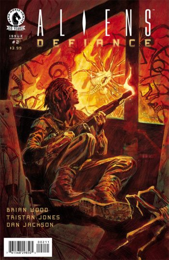
Review: Aliens: Defiance #2

If you know the Alien saga, then you know what you’re getting here. We know that the aliens will show up and when they do all hell will break loose and people will die. In the first issue of Aliens: Defiance the suspense just wasn’t there and the aliens were revealed in an uninteresting way. There wasn’t enough build up to be afraid for the characters. In this issue that problem was definitely fixed. The main character Colonial Marine Zula Hendricks has joined forces with her rouge android partners to eliminate the remaining xenomorphs on a space station. The story takes elements from the first few Alien movies. Zula and her team slowly uncover more evidence of the xenomorphs. The tension is there because we don’t see the creatures but we know they’re there and so do the characters. What makes this issue unique is that it focused more on the internal struggle of Zula as she reflects on her past failures and how this new threat is testing her. Much like Ripley the strength and courage to battle the hideous alien threat, Zula does the same.

29851The action scenes are very much improved. The pacing of each page during the confrontation with the alien shows just enough detail to be terrifying. The layouts still mirror a lot of the scenes you would see in the movie and unfold in the same order that a camera shot would. The layers of shadow that are shaded into the space station keep the mystery and tension going. Part of the terror of space is that you never know what’s in the dark void around you and that definitely is used to set the tone of this sci-fi horror series. Unfortunately some of the same artistic issues occur here. Character designs are inconsistent in some pages and background details are weak.

Overall I’m torn about how to feel about this series. If it were a movie then the story would be strong enough to hold my attention and the special effects would distract me from the flaws but because it’s a comic book I just expect more. The Alien franchise has a successful formula that is hard to mess up. Comic books rely on strong storytelling and consistent artwork. The artwork is pretty weak overall in this series thus far. The storytelling is enough to make it an enjoyable read.

[su_box title="Score: 3/5" style="glass" box_color="#8955ab" radius="6"]

Aliens: Defiance #2 Writer: Brian Wood Artist: Tristan Jones Publisher: Dark Horse Comics Price: $3.99 Release Date: 5/25/16 Format: Ongoing; Print/Digital

[/su_box]

Review: Tomboy #5

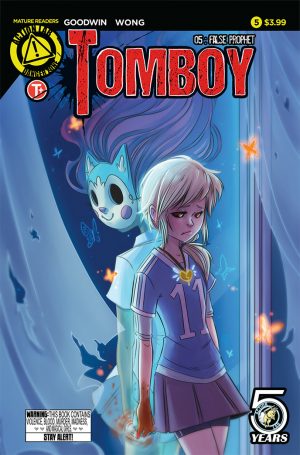
It’s been a little bit since we last saw Tomboy. This issue eases us back in which is smart writing from creator Mia Goodwin. If she had chosen another bloody murder scene that would have been very off-putting. Instead we start with our corrupt police officer and see that he’s just a regular guy when he’s away from the office. He’s hanging out with his former partner’s wife and kid and clearly it’s one of those situations in which he’s developed feelings for the family. Meanwhile Addison’s friend Jessica has been taken by the corrupt cop just after her father passed along a thumbdrive with all the evidence of Trent’s wrongdoings. Addison wants to save her friend, but her grandpa tells her that she’s risking everyone’s lives and that her friend will never look at her the same again. Tough choices are ahead for her.

Tomboy #5What’s really interesting about the story is that even though there’s all this corruption, the two original murders and all of Addison’s murders that followed have spelled the end for Trent no matter what. It’s snowballing as more and more people turn on her and while I don’t think the ending will be happy in any capacity, at least the bad guy is destined to get what’s coming to her.

Goodwin’s artwork continues to be animated and flow naturally. I’ve said it before and I’ll continue to say it, Goodwin doesn’t waste a panel. Even simple things like a fallen flower is just poetic and plays to the story. The strongest parts of the issue were hands down the opening and the ending. They tie together which is what makes them so good, but almost all of it is the visuals. The simple touches like photos and cutting away from violence.

Goodwin’s writing hasn’t stumbled in the least bit. As I said, she wisely eases us back into the story. It’s not an issue for new readers to jump on to, but rather the start of the second story arc. Sure a new reader could start here but it’s more of a reminder for current readers and I wish more comics would do this. What I continue to find incredible about Goodwin’s writing is the fact that she juggles so many characters, but keeps them and the story moving. The characters don’t bog the story down, nor does it feel like Goodwin is forcing them upon the story so we don’t forget about the. Everyone moves the story and plays a role in the plot.

Michelle Wong joins this issue as the colorist. She keeps the book looking like Goodwin’s previous coloring which is nice. I honestly wouldn’t have known it was any different without the credit page. It’s consistent, it looks good and it keeps the feel and intensity that Goodwin established so kudos to Wong. I look forward to seeing her coloring on the rest of the arc.

This was a happy return for me this week. There was some good comics I read this week and some bad, but thankfully this was on the former's list. Tomboy is currently one of my top books closely tied with Henchgirl. They’re very different comics, but they’re both a single vision from a creator at the top of their storytelling. If you’re curious about this series, grab the first trade and get caught up.

[su_box title="Score: 4/5" style="glass" box_color="#8955ab" radius="6"]

Tomboy #5 Creator: Mia Goodwin Colorist: Michelle Wong Publisher: Action Lab/Danger Zone Price: $3.99 Release Date: 5/25/16 Format: Ongoing; Print/Digital

[/su_box]

Review: Satan’s Hollow #3

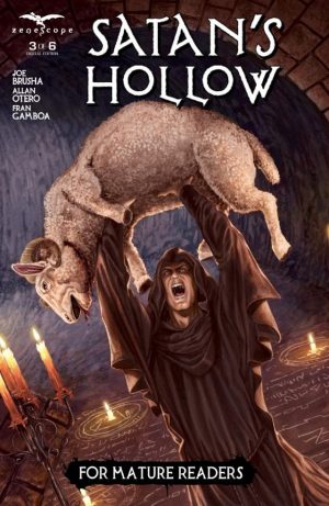
The cover piqued my curiosity with two eye-catching elements: 1) a deranged adept standing in a candle-lit room with summoning circles inscribed in the floor as he held aloft a sacrificed ram and 2) the words “For Mature Readers” boldly set against a black frame at bottom center of the page. I was in the mood for a good, adult book that grappled with mature themes in a smartly told story.  This book did a fine job of satiating my interests.

Satan's Hollow #3Although I jumping aboard a little late, I figured out the premise of the series.  A young woman named Sandra has been investigating some odd and tragic events that center on the tunnels around a place called Satan’s Hollow.  This Ohio town seems to be plagued by unnatural disappearances and unexplained occurrences.

The book does not hide the fact that the events emanate from Satan’s desire to return to Earth via a portal.

The illustrations and coloring are excellent.  The opening pages of Sandra exploring the night utilize bold hues of blues and blacks against a white moon, and the picture conveys the nightmarish tone brilliantly.

I had a great deal of fun reading this book.  If I were to voice one issue with Satan’s Hollow, it would be that the demons don’t come off too frightening.  The panels in which the humans possessed reveal their demonic hosts via shadows work so well, but the images of the demons come off a little to bland.

Aside from that, Satan’s Hollow gets its point across well, and that point is to scare the hell into you.  I look forward to the next issue.  I only wonder why the publisher didn’t stagger the release two months so the last issue comes out in October.

[su_box title="Score: 4/5" style="glass" box_color="#8955ab" radius="6"]

Satan’s Hollow #3 Writer: Joe Brusha Artist: Allan Otero Publisher: Zenescope Entertainment Price: $3.99 Release Date: 5/25/16 Format: Mini-Series; Print/Digital

[/su_box]

Review: Zombie Tramp #23

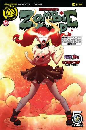
For a while now, probably a year or so I’ve been asking for this series to do something new and different with the story… never did I expect it to do what it did. I’m not going to say what it is exactly, but I will give an example that will likely spoil it for you so be warned. And even after saying that it’s still something you need to see rather than hear about to be spoiled. Morning makes her appearance just in time to distract Yagga. She then chews out Janey and Xula for basically being children. She tells Janey that the book she stole is alive and that you don’t read it, you experience it. Which really changes everything. Before Morning begins her battle with Yagga, who is kind enough to let them all stand around and talk, she tells them they gotta DBZ this shit… and it’s spectacular.

Zombie Tramp #23Being a fan of this series, I didn’t mind the exposition. That and it’s been needed. The series unfortunately spent too much time just kind of being whacky and having Janey stumble into trouble. When Mendoza went solo on the writing the series started to take a real direction, but it couldn’t afford to slowly build up the storyline it’s on anymore, meaning we’re going to get some exposition. Love it or hate it, it’s needed here.

Even with the exposition there’s still a lot of vagueness to the dialogue at times. Xula seems to know what Janey’s destiny is and apparently it’s the one that Morning turned down. These three ladies are connected for sure and I like that Mendoza cleverly threaded that storyline with his one-shots. This issue is everything the series needed in order to keep going because it has just laid down a foundation for a much bigger and far more interesting story than it’s had up until this point.

TMChu’s artwork continues to be strong. He’s improved a lot on the series and his panels are no longer blank backgrounds. Every panel now looks and feels like it’s a part of the setting the story is taking place in. That and the DBZ moment is just so fucking cool. The design is fantastic and takes the aesthetic of the series to a new level.

I’m pumped by this issue. It does sadly end just as it’s getting good, but that means the conclusion should be pretty damn good. Which is strange to think about, this storyline is concluding. It’s been a quick ride, but hopefully it continues this pace of pumping out the hits. This series has had a problem in the past of not keeping Janey moving and working towards anything new, but now that problem seems to be solved. That and I’ll say that it’s kind of better with Janey having other people to talk to so if she picks up to regular cast members it’s for the best.

[su_box title="Score: 4/5" style="glass" box_color="#8955ab" radius="6"]

Zombie Tramp #23
Writer: Dan Mendoza
Artist: TMChu
Publisher: Action Lab/Danger Zone
Price: $3.99
Release Date: 5/25/16
Format: Ongoing; Print/Digital

[/su_box]

Review: Afterlife with Archie #9

I've wondered more than once over the last few years about Archie comics' continued relevance. Some books have been clear stunts involving the death of a main character or the introduction of a homosexual one. Other have been silly cash grabs like Archie Vs. Predator (a spiritual successor to Archie vs. Punisher). But beneath each of these titles is the same basic, silly fantasy of the idyllic 1950s that has remained roughly unchanged since it really was relevant (or at least, not out of date). In the best arc of Ed Brubaker's Criminal ("The Last of the Innocent"), the world of Archie was corrupted by crime and murder, using the iconic innocence of Riverdale as a stand-in for a desperate man's nostalgic past. When I first read Afterlife with Archie, I recognized immediately that it was an excellent horror book, but I wondered why it needed to be about Archie characters. I thought at first it might be, like Criminal, using the corruption of the Archie world to represent an adult loss of innocence (or at least, make the loss of innocence that much scarier), but I now see things a little differently. Afterlife with Archie posits a world where the relationships and characters taken for granted for fifty years, are in fact living, breathing, deeply flawed individuals inhabiting a much darker world than they would ever notice or admit. The arrival of the undead does not create darkness but highlights what was already there. It's a clever approach, and one that, through the writing of Aguirre-Sacasa manages to avoid the arbitrarily gritty re-imaging that comics sees on a daily basis (looking at you 'Scooby Apocalypse').

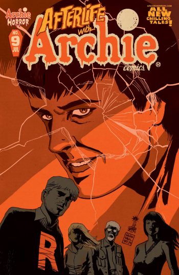
Afterlife with Archie #9This brings us to Archie #9, a rich study of Riverdale's resident asshole, Reggie Mantle: the man who started all the madness by killing Jughead's dog in the first place. The issue is told from Reggie's perspective as he wrestles with his guilt and self-loathing for causing the apocalypse but also simply for being a bad person. It's a touching look inside a character who has been a literally two dimensional bully for the entire history of Archie Comics. In the space of 30 pages, I had come to sympathize with and care about Reggie more than many a main character in lesser series. I am still mulling over a final, surprising character beat, but it's a testament to Aguirre-sacasa as a writer that there's so much to chew on in a single issue.

The release schedule for Afterlife with Archie has, as anyone who has read up to this point will know, been awful. As such, it's unclear to me exactly how this issue will fit into the larger ongoing survival story of the main cast, but as an issue in its own right, it's one of the best I've read in quite some time. Afterlife with Archie has been brilliant in its unwillingness to fall squarely into the cliches it plays with, never satisfied to be merely an odd Archie book or even merely a great zombie book. In this issue some of the stranger elements of the mythos begin to come into play, and the future for Archie and the rest of the Riverdale gang looks grimmer than ever (not to spoil, but the villain of the piece is a hell of lot scarier than Mr. Mantle).

And of course, Francavilla continues to bring his own charismatically shadowy style to the issue. I don't know that I could pinpoint why exactly Francavilla's work, which is in many ways fairly simple, works as well as it does, but AWA #9 is as sharp looking an issue as one could hope for. In the very beginning, I wished that the series had opted for a more traditional Archie style to highlight just how strange the invasion of the undead was, but in retrospect, Francavilla's distinct noir look instead highlights just how different the book is from traditional Archie--which is of course, exactly the point.

[su_box title="Score: 5/5" style="glass" box_color="#8955ab" radius="6"]

Afterlife with Archie #9
Writer: Roberto Aguirre-Sacasa
Artist:  Francesco Francavilla
Publisher: Archie/Archie Horror
Price: $3.99
Release Date: 5/25/16
Format: Print/Digital

[/su_box]

Group Review: Scooby Apocalypse #1

Last week our group review took on Future Quest and so it was only fitting that we’re back with Scooby Apocalypse! Is it great, is it better than great? Or is it a turd waiting to be flushed? Find out as our participating reviews give their take on what’s sure to be a comic with several variant covers… most of which are illustrated by veteran artist Jim Lee. [su_quote]Comic Bastards’ synopsis of Scooby Apocalypse #1: From Jim Lee’s brain to your hands. Find out what happens when DC attempts something in the vein of Afterlife with Archie minus the focus on story. Oh and hipsters… lots of hipsters. Pretty sure Jim Lee doesn’t actually know what a hipster is.[/su_quote]
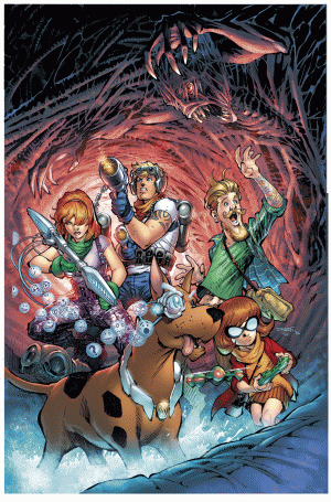

ScoobyDoo_LeeCVRCARL: 2/5

The adult-themed origin story of how the group assembled is the product of the fan theory that Scooby’s world is a post-apocalyptic earth.  While I got the premise of the book, I felt only moderately entertained by the execution.  For instance, I chuckled when Scooby belted out a “Ruck” after being offered vegan pizza.  Those understanding of Scooby’s speech impediment will clearly get the implied expletive.

Some elements left me nonplussed.  For instance, I’m sure there could have been some good gimmicks to come from the emotive headgear that allowed some of Scooby’s thoughts to appear like tiny picture bubbles.  And why did the book rely so heavily on vast amounts of dialogue to carry the story along?

The modern-day versions of the characters did have some good thought behind them—by visually and conceptually.  Shaggy’s hipster image and his dog-training persona fit well into the contemporary reflections of society.  And the nanite creations seem to be the scientific panacea for some many plot elements.

There are a lot of things that are interesting and some that aren’t—and that leaves a reader with a meh feeling.   For that reason, I must defer to a real middle-of-the-road score on this one.  Nothing really made me want to put the book down, but nothing impressed me.
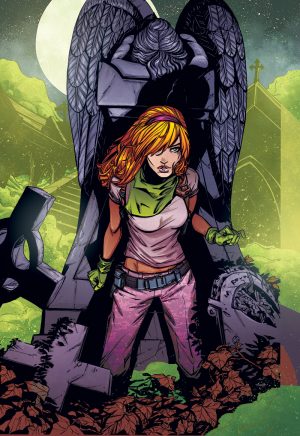

scooby-variant_daphneDUSTIN: 2/5

I was going to troll this group review hard and just absolutely gush about how fucking good this book was and that this is who you do it and way to go DC. Then I read who was writing it and I was like, “this book is never going to shut the fuck up.” In fact, as I write this I’m pretty sure that it’s still out there talking somewhere. Just in an endless circle of dialogue that manages to be both exposition and vague at the same time.

I don’t know what it is about comic writers, but when they hit a certain age, let’s say “golden”, it’s like they can’t stop themselves from over writing. Not only does every character talk way too much and you could realistically trim 3/4’s of the word bubbles and tell the same story, but none of it serves to add any characterization. What’s worse is that the story doesn’t even rely on your previous knowledge of these characters to help in that characterization.

The art is good minus the fact that every hipster has been in the gym for their entire life. The story sucks a lot and there’s nothing believable about the dialogue. If someone talked for five minutes straight telling you the craziest shit you’ve ever heard in your life and you didn’t stop them and tell them to shut the fuck up, you’d probably find yourself at a comic panel for this very comic and that’s the only reasonable excuse for letting ever character rant and not have the other characters interject in a believable way.
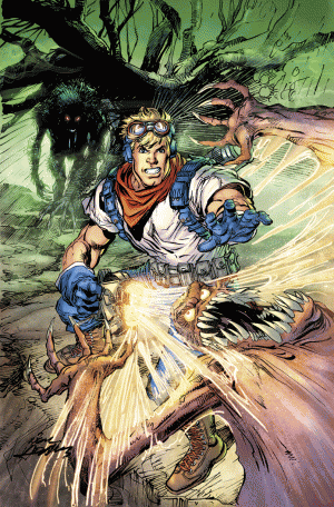

Scooby-Apocalypse-Variant-Cover-Fred-Jones-by-Neal-AdamsASA: 2/5

There's quite a bit wrong with 'Scooby Apocalypse' and I think the line that best sums it all up is "He's with 24602--the one we call Scooby Doo'. It's a line that is a painfully on the nose nod to the larger franchise which manages to be awkward, over-serious, and a little nonsensical (I mean, why is he even called Scooby Doo?). Unlike last week's much better Future Quest, there doesn't seem to be a lot of direction or purpose to Scooby Apocalypse (which would more accurately be called Ultimate Scooby Doo as it's formula is right out of Marvel's recently defunct else-worlds line).

Yeah, Velma is a corrupt scientist, Fred and Velma are reporters, Scooby is a science dog, and Shaggy is an oddly handsome hippy dog trainer, but there's no compelling reason why we need such a radically different, mostly dull retelling. The magic of the equally dumb on paper 'Afterlife with Archie' was taking a story of innocence and watching it crumble, but Scooby Apocalypse at best gives a few mild laughs and action beats that don't do much for me as a one-time watcher of the cartoon and even less for me as fan of comics.

Also, as a final note, I don't quite understand what's going on with the art in this issue. It's not bad, in a stylized, DC house style sort of way, but every panel is a nearly identically composed shot of the characters talking. It gets so dull and repetitive that I found myself longing for something that would be harder to follow if it would just mean breaking the monotony.
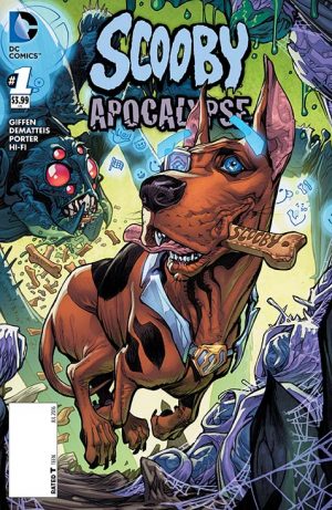

SD_Apoc_cv1_scooby_varJUSTIN: 1/5

Simply put, as a 'Scooby Doo' fan, it's so insulting it almost comes back around to being funny. The 'extreme' update of the characters (not yet a gang in this universe) are so vicious, unpleasant, and contemptuous of each other and people in general you'd think you were reading mid-2000s Mark Millar. Ever wanted a Scooby Doo property where Daphne compares Velma to Hitler? 'Scooby Apocalypse' everyone!

The art is professional, but designed in a horribly dated way, which I guess is supposed to be... intentional? The script, despite its jackassery, seems to take itself painfully seriously, making the ironic 90's throwback art... not ironic? Or is it all supposed to be ironic? And if so, who really wants a book so cynical and joyless that it thinks that this sneering parody would be entertaining? The closest comparison I can think of is the mean spirited but utterly magical 'Archie Vs. Predator', only without the unexpectedly gratuitous gore and with 90% more paragraphs worth of exposition word bubbles.

But like I said, this book is so crass, ugly, and ill-conceived that it actually does become funny in spite of itself. I'm not going to claim any disappointment here, I already cringed it out from the cover when it was first announced. I will say however I was genuinely surprised by how awful it was, a spectacular landmark in Scooby's library that overshadows any recent projects that come to mind. Don't exchange a cent for this book, but find a good play-by-play review if you can find one online, so you can enjoy the fetid treats in this book from a safe, financially ethical, distance.

[su_box title="Scooby Apocalypse #1" style="glass" box_color="#8955ab" radius="6"]

Writers: Keith Giffen, J.M. DeMatteis Artist: Howard Porter Publisher: DC Comics Price: $3.99 Release Date: 5/25/16 Format: Print/Digital

[/su_box]
Review: Prison School - Vol. 2 & 3

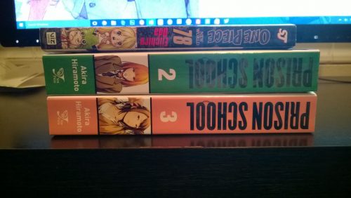
I really didn’t want to review these two volumes together, but the only way that was going to happen was if I didn’t read them together. Here we are. Reviewed together because I couldn’t help but read these two massive sized manga back to back. I mean we’re talking 380 pages each. Together that’s 760 pages! Yes, I did pause to use a calculator. Don’t you judge me! If that’s not a statement of just how damn good this series is then I don’t know what is. There is no other series that I can say that I sat down and read 760 pages in one sitting, no breaks. None. If the next volume was out I would have read that as well. If I hadn’t read the first volume already I would have read that as well. Okay I know that number really isn’t sinking in so here’s a picture of the side profile of the books together with a normal size manga to compare.

WP_20160523_009

Now, I wholeheartedly recommend that you just go read the series. Watch the anime, whichever or both they’re great. But for those of you that need some kind of summary of the volumes here you go:

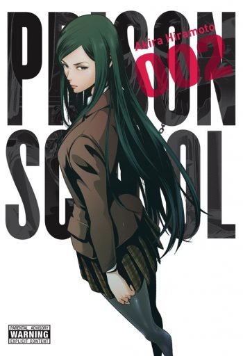
Volume 2 finds Kiyoshi and Gackt totally fucked by the fact that their hole in the wall has been covered. Gackt has given up seven years of his life and shit himself for nothing. Kiyoshi desperately comes up with another idea… cross-dress. His plan is to steal a girl’s uniform and just walk out the front gate. Gackt goes along with the plan, but adds to it by being a total ass to the President and Prison School Vol 2Vice President. To make amends he has the VP shave his head. He then gives the hair to Kiyoshi who thinks it’s really fucking gross… and it is. I mean hair? Come on… that’s gross. Spoiler for volume 2, the plan works, but Kiyoshi makes the discovery that Chiyo is the President’s sister and the Chairman’s daughter meaning he gets busted… she also now finds him gross because he somehow managed to steal her uniform to sneak out.

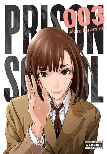
Volume 3 is fan-fucking-tastic because the power dynamic of the prison has changed. Kiyoshi has covered for Gackt's role in his escape, but now finds himself on the outs with the other boys. He’s started to earn their trust back, which is good since he’ll need them unite if they’re going to stop from getting expelled. Why? Because the Shadow Student Council has enacted E.B.O. aka Expel the Boys Operation… and it’s working. Also, more fun with Hana as she takes Kiyoshi to the nurse’s office after getting stabbed in the ass with a sharpened stick. She wants to pee on him and see him pee… while he’s putting ointment on his asshole. They end up bottomless together under a cot when Chiyo comes to check on Kiyoshi. Let’s just say that nature takes its course and little Kiyoshi reaches out and touches faith… I mean Hana. Hilarity ensues.

To say that this series is hilarious is a bit of an understatement for me. It’s funny all the time. Everything that feels serious like the fan service is actually just satire. We spoke in great lengths about this on this week’s episode of Super-S so I actually recommend listening to that in addition to this review. Aside from the comedy and the satire there’s this realistic prison story going on still. There’s shanking, there’s “rats”, escape plans, a pecking order. There are all these things that on their own would actually make for a hell of a prison story. It’s the fact that its paired with the comedy and the satire that makes it so good, but what makes it great is that it’s a high school. It’s very easy to forget that at times, but when you remember that all of this is in high school it makes it so damn funny.

Prison School Vol 3Akira Hiramoto’s art continues to be some of the best I’ve ever seen in a manga or a comic book period. I recently read 7th Garden and while the art was technically great, it lacked personality and passion. When I look at something like Prison School it’s oozing with passion and trickling with personality from every page. There’s never a wasted panel. A filler page. All of the art has beauty and meaning to the story. The art tells so much of the story on its own and is really a display of a master at work. To put it plainly I lack the knowledge to praise the art any further, but fully acknowledge that it deserves more praise.

Volume 5 of Prison School isn’t out until July 26th… that’s a long time to wait in my book, but this series is absolutely worth the wait. Sure I could find it online to read, but there is something beautiful and wonderful about the trade paperbacks. The covers are classic and the additional pages of character art are beautiful. And if you haven’t read the series yet, well then you have roughly 60 days to read 1,140 pages of a story that is bound to be a classic.

[su_box title="Score: 5/5" style="glass" box_color="#8955ab" radius="6"]

Prison School Vol. 2 & 3 Creator: Akira Hiramoto Publisher: Yen Press Price: $20.00 each Format: TPB; Print/Digital

[/su_box]

[su_button url="http://www.hachettebookgroup.com/authors/akira-hiramoto/?yen" target="blank" style="soft" background="#0d0b0a" size="7" center="yes" icon="icon: external-link"]WEBSITE[/su_button]

Review: Disney Magic Kingdom Comics #1

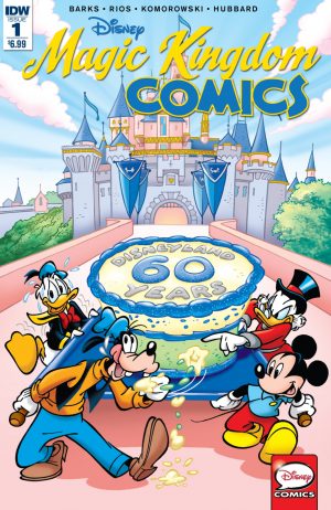
The beloved Disney characters interacting in the theme parks will strike a nostalgic cord in readers as IDW collects and reprints those stories.  Scrooge McDuck races the Beagle Boys in a paddlewheel boat adventure.  Mickey Mouse and Donald head off to Frontierland for jamborees—Country Bear style.  Uncle Scrooge returns with Donald, Daisey, and the triplets for some Adventureland excitement.  Finally, poor Goofy runs afoul of those nasty Disney villains when he ventures into Fantasyland. MagicKingdom_01-CoverAThe reprintings are a great collection for children and adults with a child’s heart.  Readers will enjoy great tales focusing on the areas of the theme parks that we all have visited.  Where kids will get a kick out of stories featuring the beloved Disney characters, adults will be fascinated by the liberties writers took with story elements before society felt the need to sanitize comics and cartoons.  For instance, Scrooge McDuck will use gunpowder and whale oil as fuel to propel his paddlewheel boat.  In that same story, Ratchet Gearloose tries to coax his brain to think of a problem’s solution by clocking himself on the noggin with a hammer.  Yes, that was the beauty of writing back before we became hyper-sensitized and over litiginous.

IDW did an outstanding job of reprinting, for the colors are vivid and the panels are flawless.  In fact, the updated collection looks as if it were illustrated in today’s world of crisp digital production.

Despite the steep price, this collection does fit perfectly into homes with kids and for Disney aficionados who love the characters, the theme parks, or both.

[su_box title="Score: 4/5" style="glass" box_color="#8955ab" radius="6"]

Disney Magic Kingdom Comics #1 Writers: Carl Barks, Paul Halas, Unn Printz-Pahlson, Don R. Christensen Artists: Carl Barks, Pete Alvarado, Victor Arriagada Rios, Al Hubbard Publisher: IDW Publishing Price: $6.99 Release Date: 5/25/16 Format: Print/Digital

[/su_box]

Review: East of West #26

My, my... bless my well-powdered nethers, that was a good issue. That opening is cribbed from the ever quotable Archibald chamberlain, spoken in greeting to the president of the free world as he languidly smokes a cigar in the presence of a demon--it's just that sort of an issue.  Recently there's been a change in momentum for East of West. After three or so arcs of groundwork, the book has hit critical mass with a large cast of characters each with distinct motivations, appearances, and morals. Hickman seems to be getting a good deal of joy at knocking the characters together and watching the sparks fly, like a child with a group pre-apocalyptic, vaguely religious action figures. Nowhere has this free-for-all new style been more apparent than in East of West #26 where well over half the issue is spent letting the members of the summoned Chosen simply react to each other. Archibald snipes cheerfully at Antonia Levay, John Freeman celebrates a reunion with his dearest of friends, and weapons are pointed all around. It's a fun structure that borders on the comedic a little too hard (it's easy to imagine Ezra's cave a sitcom sound-stage as the characters enter and exit with too convenient timing). I would imagine the main problem here is one of scale: the exchanges between characters are as sharp as ever, but for such a momentous event in the comic's mythos, things seem a little small and contained. East of West has, however, always read better as a novel than a serial, and I expect this issue will work better as a prelude to what's sure to be an exciting, and likely blood-spattered, meeting.

East of West 26Working to this issue's advantage is the b-story which, to myself and many longtime readers' delight, is a Death story. In world where every comic and film brims with quiet, angrily, ultra-masculine action heroes like Frank Castle, Mad Max, Jason Bourne, Bruce Wayne, and Judge Dredd, it can be easy to take Hickman's Death for granted. But I think there's a soulfulness with the white clad cowboy that only the best versions of those characters are granted. Death isn't a cold figure, he's an emotional one, cut from the same cloth as the hardened but sensitive western heroes of John Wayne. This issue has Death pursuing a reunion with his son, with the help of an increasingly shady bartender. Also highlighted here is the faintly (but never overpoweringly) ridiculous nature of Death's overblown steely bravado. While I love his skill with a six-shooter, I am equally in love with the ridiculous image of Death leveling it a pink, slimy, talking eyeball.
At this point in the series, we've had a lot of buildup punctuated by occasional brief bouts of over-the-top violence. This pace has, for the most part, worked very well, but Hickman appears to be winding up to speed things up some, and I am excited to see the excrement hit the rotating-bladed cool-air blower (it seemed classier than 'shit hit the fan'). After all, in the style of the series, we've got a beautifully written and drawn world all laid out in stunning, careful detail--it's high time to blow it up.

[su_box title="Score: 4/5" style="glass" box_color="#8955ab" radius="6"]

East of West #26 Writer: Jonathan Hickman Artist: Nick Dragotta Publisher: Image Comics Price: $3.50 Release Date: 5/25/15 Format: Ongoing; Print/Digital

[/su_box]

DC Reveals the Cast of DC Rebirth

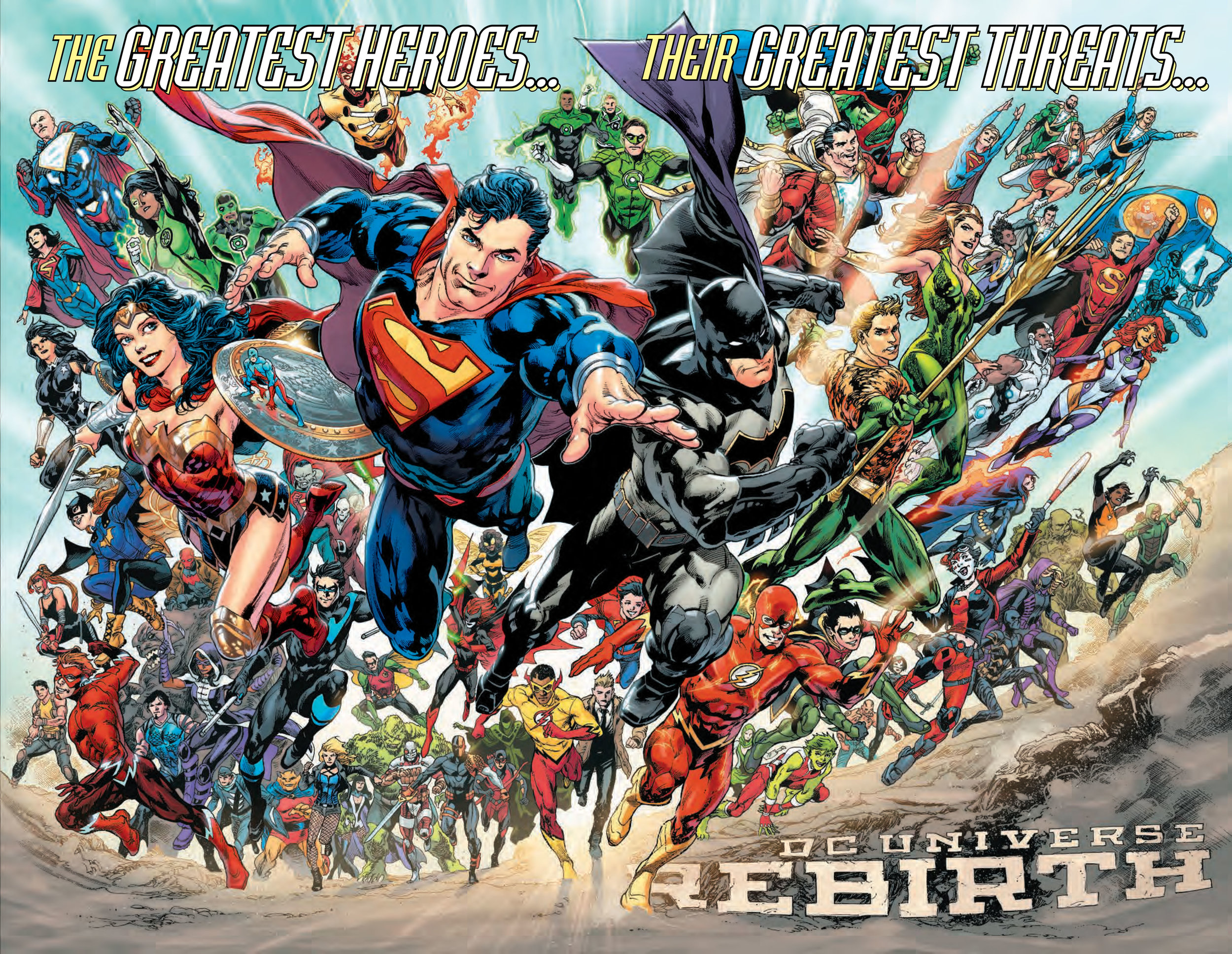
Well if you followed along with DC's social media then you saw this image split into four. It's basically along the same lines as the one they did for the New 52 and for when they drew a line in the sand for a $2.99 price point. So that's the new DCU... let's see if we spot anyone notable.

  • Sorry Martian Manhunter... your face is their greatest threat currently.
  • Sorry Firestorm... no one cares about you.
  • Too many assholes wearing an "S". Six or Seven total, there's a guy cut off by the Flash's arm and Bizarro I guess counts.
  • Too many Marvels. Six total.
  • Harley Quinn is apparently a good guy now? AND Deathstroke and Deadshot... or they just couldn't resist adding movie characters on here.
  • Too many Green Lanterns and not front and center anymore...
  • Green Arrow moved to side where he belongs.
  • Two Batgirls and a Spoiler... too bad we've been without Spoiler for too long at this point.
  • Two Blue Beetles... seriously get ride of the alien one.
  • The Atom is allowed to ride on Wonder Woman's shield...
  • Batman's costume still sucks.
  • Why the fuck is Aquaman and Mera front and center?
  • Donna Troy is on the wrong side of the page.
  • Too many Wally Wests. Pick one. We don't need fucking two of them and you're going to get backlash either.
  • Nightwing is alive, that's too bad.
  • Two Robins, a Red Hood and a snapback Arsenal.

That's all I care to really list. While it's somewhat nice to see them return some of the character overlap like Cassandra Cain Batgirl and Spoiler, when you mix that with Hipster Batgirl that doesn't really work. Two Wally's... that doesn't really work. When there was legacy that was different from just having two fucking versions of the same person. That doesn't really work for me.

REBIRTH-splash

Review: Embroidered Cancer Comic

Cancer sucks. I don’t think anyone will argue that. Collectively as a society we’ve grown to talk about it more and bring awareness to subject of cancer. That’s why projects like Embroidered Cancer Comic are so important to talk about, because it’s talking about a subject we’d all rather avoid. As if saying the word cancer will give us cancer.

Embroidered Cancer Comic is exactly what the title states. It’s a series of two panel pages of comics that were all embroidered. The story is about a wife and her husband as he goes through Prostate Cancer. It’s autobiographical and a pretty straightforward and short story. It’s also a pretty damn good story considering it’s all embroidered.

Embroidered Cancer ComicThat is a really weird, but cool choice. Does it do anything for the story? No, but it was a skill set the author had and so she went with it. It’s bold is what it is.

The embroidery isn’t extremely detailed. It’s rough for sure, but there is definitely a charm to it. It serves the art and honestly fits the autobiographical comic genre.  As it goes on in the story it tends to get better and better.

I don’t know if everyone is going to rush out and get this book. It’s informative to a degree, it’s definitely personal and a sweet story, but it’s hard to say that every comic reader will want to read it. That’s not because of the subject matter either, it’s just a very one and done story. You’d get nothing out of it by reading it twice and if you bought it there would be nothing stopping you from giving it away to someone else to read. Even still, I think it’s a very good book and one that’s at least worth reading.

[su_box title="Score: 3/5" style="glass" box_color="#8955ab" radius="6"]

Embroidered Cancer Comic Creator: Sima Elizabeth Shefrin Publisher: Singing Dragon Price: $12.95 Format: Hardcover; Print

[/su_box]

[su_button url="http://singingdragon.com/usa/the-embroidered-cancer-comic-33978.html" target="blank" style="soft" background="#0d0b0a" size="7" center="yes" icon="icon: external-link"]WEBSITE[/su_button]

Review: 7th Garden Vol. 1

Get ready for demons and angels because that’s the foundation for 7th Garden. In the typical manga twist though the demons are kind of alright, while the angels and religion are of course really evil. It’s an formula that’s been used just as many times as any other manga formula. When you boil it down though its all about A) the journey B) the characters and C) the art. Let’s start with “A” shall we? The journey is pretty damn boring. Dude wakes up a sleeping demon, demon is of course fan serviceable and must sleep in the nude. Shit happens in town when the church comes to kill everyone… who knows why, they're just getting their purge on. Dude must make a deal with the demon who for some reason allows him to go back to his normal life and decides to become a part of the maid staff at the house dude works at. I’m not using names because we’ll cover that in “B”. Eventually dude and demon woman team up to fight other dude and angel woman… spoiler, the demon used to be an angel and she now wants to rule the earth. But like the proper way. Naked in bed I assume.

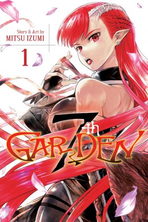
7th Garden #1As for the characters, the dude is named Awyn Gardner… he’s also the fucking Gardner. A little too on the nose. He has super impressive knife and fighting skills because of whatever past he’s running away from. It’s teased some, but at awkward points in the story making it feel out of place. The demon woman’s name is Vyrde and we don’t learn that until the 76th page and then the last page we learn her angle name... way too long to wait for either. She’s just the fan service character. In this world the demons/angels become weapons for humans so it really makes their power seem shitty when they need someone to wield them. The other main character is Awyn’s boss/love interest. She’s so one-dimensional that I’m not going to talk about her in any depth. The characters aren’t unique and they’re not interesting. Awyn’s name sucks a lot and his gimmick of loving to garden is just… blah.

As for “C” the art is serviceable. My problem with it is the character designs that lack any imagination. They look recycled from other properties and I know that’s really mean, but it’s sadly true. There’s not a hint of originality to them. The art is detailed, but it lacks personality and doesn’t bring the world to life. It’s just there. There’s no emotion emitting from it. Instead it looks like an artist that’s lost their passion or is being too heavily edited. Especially the action which seems like it’s always missing just one extra panel.

Since this series started in 2014 there’s probably a decent amount of material for it so if anything I said struck your fancy then you’ll have plenty to look forward to. For me, I’ve seen and read too much that’s similar to this to really be interested. It definitely gets better by the end of the volume, but the pacing is a mess throughout. It loves just showing a flashback in the middle of telling you the story and that breaks you from the story. I didn’t hate it, but by no means did I love it. It was just sadly average and while average is nice sometimes, I needed a bit more here.

[su_box title="Score: 3/5" style="glass" box_color="#8955ab" radius="6"]

7th Garden Creator: Publisher: Viz Media Price: $9.99 Release Date: 7/5/16 Format: TPB; Print/Digital

[/su_box]

Review: Batman: Europa

I figured I should review this before the reboot since no one is going to give a damn about it for a good long while. To be honest, I don’t know much about how this book came to be. I'm fairly certain it was a mini, but when it was released and all that eludes me simply because I don't care. The idea behind this book is interesting, but it’s one that really needed to be explored in a story that was more than four chapters. Batman in Europe is the basic idea, but instead of letting him get a feel for the city and ultimately comparing it to his mistress Gotham, we’re instead handed a few set pieces and thrown some typical action. Oh and the Joker is there… he’s Batman’s partner… it’s a team up book… Batman and Joker do Europe… I fucking kid you not.

If you’re not turned off by this story yet I will continue to tell you that this was clearly DC’s attempt at recapturing some of the magic from Jeph Loeb and Jim Lee’s “Hush” storyline. That right there should tell you the idea behind the plot which is a long time Bat villain pulling all the strings until the final reveal. If you want to know the ending, I won’t spoil it here, but you can listen to this episode of the CBMFP to find out the answer. I recommend that over reading this book.

Batman EuropaYou’re probably wondering why Batman had to team up with Joker? Well as he puts it, they’re both been given different pieces of the same puzzle. Which is true for about a minute. When they team up it stops being true because they’re just teamed up and stopped receiving different parts of the puzzle anymore. They’ve both been infected with a virus and the solution is really stupid… I mean I figured it out in the first chapter of the story and yet the world's greatest detective had to have his hand-held and told the solution. Just goes to show that Batman doesn't detect anything anymore and that DC should maybe give that moniker to Ralph Dibny in the reboot.

Aside from the terrible team up of Batman and Joker, a lack of time spent with the cities that the story takes place in and just the overall flawed premise of those two things combined; there’s still more that’s poorly executed with this book.

The story is trying to answer the question of whether Batman will sacrifice himself to stop the Joker. A question that should never be asked, much like “what’s the Joker’s real name?” And while the story takes four chapters to set the stage for this question, it’s already answered it by having Batman team up with the Joker. Which begs the question of what the fuck is wrong with the writer’s writing this Batman story? Everything about Batman in this story is uncharacteristic of him. Sure we can say that this is out of cannon and excuse it, but when it’s using so much collective knowledge about the character it ceases to be an excuse. You don't get to pull from the collective identity that is Batman, but then fuck up all his decisions and say "whoops, it's not canon Batman."

The art is pretty whatever. I imagine that there’s some talent here and that it was a big opportunity for the artists to be on the book. Personally I only liked the Jim Lee stuff, but even then it was colored like shit. None of it was spectacular or that special and if you read a lot of comics, like anyone that picks this up is likely to do, then you’ll see styles you’ve seen before. Before the age of the internet when you couldn’t see a lot of comic book fan art from across the globe, this would have been cool and interesting. Now… I’d rather look at one of the many dedicated art sites and see better art and frankly better visual storytelling.

If you haven’t already checked out Batman: Europa, then I wouldn’t. I say that as a Batman fan. I say that as someone who was honestly curious about this book who picked it up and had everything he liked about the character and his cast just slapped in his face like a pie from a malicious clown. I’m all for trying something new with the character, but when the only thing new you add is compromising what makes the character great… well that’s not really new is it, it’s just misguided writing looking for a cheap shock.

[su_box title="Score: 2/5" style="glass" box_color="#8955ab" radius="6"]

Batman: Europa Writers: Matteo Casali and Brian Azzarello Artists: Giuseppe Camuncoli, Jim Lee, Diego Latorre, Gerald Parel Publisher: DC Comics Price: $22.99 Release Date: Format: Hardcover; Print/Digital

[/su_box]

Review: Preacher E.01 - Pilot

I have not read all 75 issues of Preacher. I own and enjoyed the first volume, but as I read it I felt as if I was late to the party. In my personal opinion the comic is a bit dated. In the same way that Watchmen and The Dark Knight Returns have had their corpses picked so much that you’ve seen their influences throughout comics, so too has the ultraviolence of Preacher. Hell, I can point out five comics just at Marvel in which writer Garth Ennis picked his own corpse like Arseface and his Marvel brother Fuckface. My point being that I’m not an authority on Preacher nor am I really shocked by it. I get that for some it was their window into “comics can do that?”, but that wasn’t the case for me. That brings us to 2016. We’ve read the casting, we’ve see who’s producing and we’ve even gotten AMC aka “The Walking Dead channel”, all lined up for a Preacher TV show. But how? How can you have the ultraviolence and the politically incorrectness of the comic on TV? Surely it must be rated X?!? To answer that question… you do it exactly the way they’ve done it here.

Step one is to get producers that are passionate about it. Doesn’t matter if they read comics or not, its Hollywood and even Robert Kirkman doesn’t give a fuck about his comics when he adapts them for TV. The next step is to get hot talent. Get that guy that stunk up Misfits for two seasons because he looks and sounds the part and get those two Marvel TV actors that everyone loves right now. The next step is the network. You need a network that’s desperate for some kind of hit after losing all their top shows and can’t seem to recreate the magic of their first comic book TV show’s success. Once you’ve got AMC it pretty much means you’re golden to do whatever.

So what do you do?

Do you stay close to the comic or do you Walking Dead this thing and use the frame-work and create a new version? Well… you’re on AMC so the answer should be pretty obvious. If you’ve read all 75 issues of the comic series then do not and I repeat, do not compare this show to the comic book. In fact, we as comic fans should never do that. They’re different mediums and we’ve seen both ends of the adaptation spectrum. On one side you have Sin City, the most faithful adaptation ever and then on the other side, oh I don’t know pick anything from Fox or Sony. The point is, they’re never going to be like the comics because that would defeat the purpose of the comics.

Now after four paragraphs you’re probably wondering what happened on the episode? Not what is it about because you’re a comic fan or at the very least saw a shit ton of promotion for this show and already know about the characters and world.

Well it’s about Jesse coming back to his home town to make good on his promise to his father who was a Preacher as well and was shot in the head. This unfolds through a series of annoying flashbacks, each longer than the last, but still the same flashback. Tulip is on the run for stealing a map for the biggest score ever and she’s a woman scorn so she’s in town to bring Jesse back into the mix of her life. Cassidy is being hunted and gets ambushed on an airplane in which he’s working as a host. And the voice of God is searching for a host and making Preachers of all different faiths explode including Tom Cruise.

Hilarious.

The pacing for this first episode can best be described as a teenage boy blind folded searching for his first pair of boobies to grope only to feel a man’s chest because he’s being pranked by older teenagers and now his raging boner pitching a tent in his underwear (he’s in only his underwear by the way) is circulating social media along with him grabbing man-boobs with a smile... and then a frown. Basically it’s groping around in the dark and not finding what it’s wants to, but still really excited that it might get there. Or just bad. The pacing is bad.

It takes 36 minutes to have our main character introduced to us and it’s a cheap pop for the comic readers. It was written and executed as if it were going to be played to a large crowd at some point, say South by Southwest, so that one idiot could cheer-shit their pants and get the rest of the people watching hyped. If any other TV show waited until it was half over to tell you whose who, you would probably give up on the show. By waiting that long you give the audience a chance to give the character a name and you know what I called him? Even knowing the character’s name, I called him Howard Stark. Because you refused to tell me his name outside of calling him Preacher. Which is the name of the show.

The acting is good. That’s the sad part about the pacing is that these actors are doing a hell of a job, but you keep letting their performance down with all the breaks and the “here’s how we all meet” origin story. Joseph Gilgun is a bit hard to understand at times, just as he was on Misfits, but after a few episodes your ears will be trained and it won’t matter. Ruth Negga is hands down the best actor on the show, even if her accent seems unnecessary. Dominic Cooper is right behind her, both with acting and the accent. He’s good at it, but he loses the deepness in his voice that makes it so distinct. Everything he says is light and whispery and it might be intentional, but let's hope they're not being that lazy and not wanting to put a filter on him when he "god talks."

The action is the best part of the show. Which is good and bad. I wanted to be into the story more, but I wasn’t. Everything in-between the action seemed like a waste of time. Like go ahead and look at your phone and just look up at the action. Even though it was the best part, the choreography and the slow motion was not the best. There’s a really bad fight between townies and some “politically correct” mascot people, which is absolutely bad-looking. Like student film, first time with a camera bad-looking.

The show itself isn’t bad, but it’s not good. It doesn’t play to the strengths of the TV medium and I don’t know if that’s a director thing, producer thing or an AMC thing, but it’s something. It shows inexperience on many levels and perhaps too much trust from AMC. It’s as if they just said, hey you’ve made films and shit all your careers, clearly you understand pacing and how to hold a viewer’s attention for an hour with commercial breaks… go for it. And then they realized they didn’t know how to do that. It’s a pilot though so really the next three will show a true vision of what to expect from the show.

There’s still a couple of questions up in the air though. If you’re a fan of the comic and haven’t watched it should you? If you’re a fan of comics in general should you watch it? And lastly, if you’re just a fan of good TV drama should you watch it? No, no and maybe.

Preacher has a long road to go before it’s pulling in fans like The Walking Dead or Game of Thrones. It’s already got one mark against it due to the subject matter which is going to chop some viewers no matter what you think, but there’s nothing awe-inspiring about this adaptation. It’s perhaps a little too safe and catered to a TV audience in all the wrong places. But hey… you probably already watched it so who cares?

[su_box title="Score: 3/5" style="glass" box_color="#8955ab" radius="6"]

Preacher E.01 Airs Sundays on AMC

[/su_box]

Thanks Spoiler McShitty Pants... DC Reveals Wally West... Reluctantly

Well over the weekend DC's Rebirth spoilers hit the net because some asshole who either loved or hated it (seems like they hated it) revealed all the spoilers for the issue forcing DC to do some damage control. You can read the really lackluster press release below. I say lackluster because the tone is clear, it's forced and was never planned on being released. DC's embracing it though... for better or worst. But fuck spoilers, the day of is one thing, but before anyone can even read it? Fuck you spoiler person. Now, if someone knows what Titan story line Wally disappears in let me know, because I'm actually more curious about that than the Dr. Manhattan thing. From DC Comics:

It's finally here! The oversized, incredible, universe-changing 80-page DC UNIVERSE: REBIRTH #1 from the genius mind of Geoff Johns is out this Wednesday, May 25th, and with it comes a shocking surprise…

REB_1_1-6

…the return of the beloved Fastest-Man-Alive, the Fiery-Haired-Flash, the Scarlet-Speedster, the "missing" Titan, Wally West!

Lost in the Speed Force until this moment, Wally will rejoin teammates Donna Troy, Arsenal, Garth, Lilith and Nightwing for TITANS: REBIRTH #1, hitting shelves June 15th.

In order to keep the mystery alive, DC solicited a cover featuring Donna Troy, leaving fans to wonder if the lost Titan would ever make a return. But now that Wally has appeared in the pages of DC UNIVERSE: REBIRTH #1, we can safely say the secret is out!

You can check out how he makes it home by picking up DC UNIVERSE: REBIRTH #1 this Wednesday, but you'll have to wait until TITANS: REBIRTH #1 to find out how the Titans react to his incredible reappearance.

Read more from writer Dan Abnett and artists Brett Booth and Norm Rapmund in June with TITANS: REBIRTH #1!

TNSREB_Cv1_r1

CBMFP 235: I'll Do It For Less Than That

We got you covered this week on all that DC news, logo, film division... that's really it unless you count Future Quest. There's a Mycroft Holmes comic coming and some other actual comic book news. You'll also hear about these books on the episode:

  • Weird Detective #1
  • Future Quest #1 (there it is!)
  • Strange Attractors #1

Previously on the CBMFP...